DESIGN PRINCIPLES WEEKLY EXERCISES
Design Principles
Week 1 (24/8/2020) - Week 5 (4/10/2020)
- Week One -
Beginning with a pre-recorded lecture, we were presented a multitude of design principles that will be crucial to our future projects. It was actually quite interesting to understand and discover the theoretical/psychological side of design!
We were then later introduced to our lecturers on Friday, Dr Jinchi & Ms Maria. Ms Maria walked us through the assignment briefs as well as what this module is all about.
CONTRAST & GESTALT THEORY
For our first weekly exercise, we will be focusing on creating contrast and Gestalt theory artworks respectively using only black and white papers. Before delving into prototyping/sketching, further research was done to better understand these principles.
Contrast by itself can be divided into different elements or more specifically, engulfs the elements to form a new piece of art. From shapes to colours to patterns and even to texture. It helps provide character and helps enhances the theme of one's artwork whether its subtle or stark.

Figure 1 - Gestalt Principles via Pinterest
Initially, most of my inspiration came from my surroundings and what I was feeling before moving onto Pinterest. Hence, many thoughtless sketching on my sketchbook and some inspired pieces.

Figure 1.2 - Sketchbook sketches
As for the CONTRAST pieces, I had two rough ideas - Merdeka & carpet tiles. I decided to step out of my comfort zone and dive into 3D prototyping for the contrast principle. Not only will they be fun but also challenging.
Since Merdeka was coming up, I thought it would be great to create a piece inspired by our Independence Day. More specifically, our flora(Hibiscus) and fauna(Tiger). Our national flower is a gentle, mellow beauty compared to the tenacious tiger, so it would be great if I could create a piece that could showcase the opposites coming together.

Figure 2 - Tiger claw inspiration via Pinterest

Figure 2.1 - Paper flowers inspiration via Pinterest

Figure 2.2 - Merdeka contrast piece progress

Figure 2.3 - Merdeka piece outcome

Figure 2.4 - Up close of Merdeka piece

Figure 2.5 - Merdeka final outcome
With 3D prototyping, I wanted to add texture using different paper media such as corrugated paper and crepe paper to create the desired texture. Especially the bark of the tree.
The next piece, Carpet Tiles, I decided to return back to the basics - geometrical shapes. Something entirely different to my Merdeka piece.
Although this piece may seem mundane, it does reflect a part of my life. Growing up, even now, I have been surrounded by different types of flooring as my dad works in this industry. He would have a multitude of samples lying around, all from carpet to vinyl to hardwood. Even though tiles are mostly considered repetition of each but I love how when they come together, they create this whole print that can showcase something else entirely. Flooring itself helps encapsulate the atmosphere of the room, either enhancing or diminishing the interior. For example, meeting rooms may have carpet to reduce the sounds of footsteps while vinyl may be better for schools due to easy cleaning.

Figure 2.6 - Carpet Tiles piece outcome

As for Gestalt theory, I have decided to attempt both closure and figure-ground principles.
Figure 3 - Globe inspiration via Pinterest

Figure 3.1 - Light bulb hot air balloon inspiration via Pinterest

Figure 3.2 - Gestalt Theory sketches

Figure 3.3 - Gestalt Theory 'Closure'

For figure-ground, I went for the combination of the light bulb and the hot air balloon. Frankly, I did not know what I want to do for figure-ground. I just knew I wanted to attempt this principle of Gestalt Theory as it was interesting. I found myself looking everywhere for inspiration - my room, my garden. Then I decided to look up and observe the sky.
Looking at how the situation of the pandemic is, it was sad to even think about flying on an airplane so I went to look for something brighter. Hence, the hot air balloon fiesta popped into my head. For two days, the sky would be decorated with beautiful and bright hot air balloons, like ornaments from a Christmas tree.
In airplanes, we are always confined in a designated place for short/long periods of time looking out through a tiny window whereas the hot air balloon, although a short experience, gives off a special feeling. The feeling of freedom as you feel the wind on your face as you overlook your surroundings.
Since the idea popped into my head, I thought of the classic light bulb metaphor to compliment this figure ground work.
FEEDBACK
- WEEK TWO -
Friday - 4/9/2020
Today I received my feedback on the works I have produced. Apart from having to add more depth into my blog about my art pieces, Ms Maria suggested that I could produce a stronger value in my Gestalt Theory 'Closure' piece.
As Ms Maria explained to me, art is not just about replicating works or reiterating inspirations found online but rather creating artworks reflecting one's identity as a creative. Thus, I have decided to improve further on my 'Closure' piece to show greater purpose and value.

Figure 4 - Gestalt Theory 'Closure' final outcome
As I was thinking of what I should add/remove in my 'Closure' piece, I reflected on how at this moment of time we are all responsible of the changes we made in this world. How we are literally holding the world in our hands. Overtime, we have abused the world of its resources - causing it to not only lose its beauty but also its strength.
In this piece, Ms Maria suggested that I could showcase 'Unity'. With that, the hands represent us humans who should be the ones revolving around the Earth instead of the world revolving around our needs. The cupping position of the hands represent delicacy and gentleness; how we SHOULD have been treating our home. With this piece, I hope that I have shown the true relationship of us and nature.
REFLECTION
Frankly, I felt intimidated yet inspired as I was surrounded by so many amazing creatives as my classmates. So for a short period of time, I was quite lost in terms of what I should explore into which led me to be artistically blocked. Hence, the mindless pieces on my sketchbook.
Overall, I genuinely enjoyed this exercise. Not only was I exposed to the principles and styles of design, I will be able to apply/attempt them onto my own artworks. Before this, I never knew there was a technical/theoretical side to design so it was an interesting and eye-opening discovery.
In terms of Contrast, I was quite happy with the outcome of Merdeka. Especially the different textures. Hopefully, I will be able to explore more textures in the future to bring my artworks to life visually and in touch.
As for Gestalt Theory, I did struggle for Figure-Ground but that was all the more reason to challenge myself to further attempt to understand it by applying it to my artworks wherever possible. On the other hand, Closure was a fun piece to work with. Carrying Ms Maria's advice onto my future artworks, art is always more enjoyable and satisfying when the artist finds the purpose/value behind the piece.
Design Principles
- Week Two -
After submitting and receiving feedback from our previous exercise, we now proceed to the second weekly exercise.
EMPHASIS & BALANCE
The 'Emphasis' principle can be achieved through various aspects such as shape, size, texture and colour. It is usually used to create focus or captivate the viewers attention to a particular aspect of the artwork. Apart from the aspect itself, what surrounds it like its colour and/or space will assist in bringing out the desired object/aspect.

Figure 1 - Lady Sun by @florenza_art via Instagram
What I enjoy about this is its simplicity. The emphasis principle is clearly depicted through the perfect orange circle compared to the organic lines of the lady's face.

Figure 1.2 - Night Windows by @haleytippmann via Instagram
I admire the tones of red the artist used to emphasize on certain windows that displayed the different things people do at night. Where there is light, the tone would be a lighter shade of red - almost pink - and the humans would be a darker red showing a contrast. Each window showcased a different story; life goes about in different phases for everybody. Although the emphasis may be subtle in the few lit windows, once this illustration is looked as a whole, there is an emphasis of colour. I adore Haley's work as she depicts mundane activities through the simplicity of pencil-like lines and colouring, and a faded colour palette for her pieces.
In terms of 'Balance' principle, it can be categorised into three parts - Symmetrical, Asymmetrical and Radial. Symmetrical Balance can be defined as a mirror image of each other. When it is folded in half, be it from the left to right or top to bottom, it will the same. As for Asymmetrical Balance, it may not the mirror image but still balances out in terms of visual weight. This is rather difficult for me to grasp still but further research will be done to understand it better. Lastly, Radial Balance is achieved through a round motive design. This can be seen on Mandala art.

Figure 2 - Sun Arch by @realfunwow via Instagram/Pinterest
What captured my attention was the motion effect the artist managed to create of the sun rays, almost resembling a fan. Once it reaches a certain point, it goes straight down. This piece has a old, divine feel to it as created by the textured parchment-like paper which encompasses the artist's style of divinity art. You cannot help but be charmed by the detailed yet simplicity of his works. If this were to be folded, this would be Symmetrically Balanced.

Figure 2.1 - Death Valley Moon III by Rosi Feist
This Asymmetrically Balanced art piece is by Rosi Feist. It can be seen through the lines of the mountains that separated the contrasting colours brought about asymmetrical balance towards the overall print. I love his works as it gives off a retro yet minimalistic feel towards the most mundane of things/sceneries.

Figure 2.2 - Gothic Rose Windows of Notre Dame via Pinterest
Apart from Mandala art we would normally see during the Diwali festival, we can see Radial Balance on gothic rose windows on European cathedrals such as the Notre Dame in Paris, France. This picture in particular shows the Southern rose window, symbolising Christ triumphant, reigning over Heaven surrounded by His witnesses on Earth. Hence, the circle as the circle is also a symbol of completion/circumambient. The cathedral was build in the Middle Ages where gothic architecture and art was at its peak.
ADDITIONAL:
THE GOLDEN RATIO & RULE OF THIRDS
Also known as phi, The Golden Ration is a mathematical concept has been used for centuries as a visual balance in art by bringing harmony, balance and structure. It helps increase the appeal for artworks as well.

Figure 3 - The Golden Ratio
Rule of Thirds on the other hand, is a simplification of the golden ration whereby an image is divided both horizontally and vertically with the subject placed either at the intersection of those lines or along one of the lines itself.
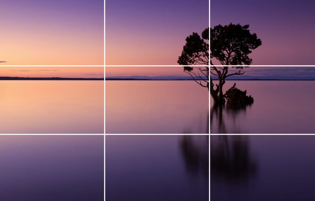
Figure 3.1 - Rule of Thirds
MY WORK
- EMPHASIS & BALANCE THEME -
When I was brainstorming ideas for this principle, I really wanted to highlight a woman's individuality. The rawness of emotions, the different body types, or even our everyday sacred skin ritual. Being a woman has no boundaries and we often create those invisible boundaries to forsake ourselves of the acceptance of who we really are.
Furthermore, in light of the petition to include sex education in our education system in Malaysia, I wanted to create pieces that showcases the importance of sexual health. What came at the top of my head was halved fruits symbolizing the female genital.
Hence, the theme 'A Woman's Individuality'.

Figure 4 - Sketchbook sketches
- EMPHASIS -
I really wanted to take advantage of the colour red. It represents so many aspect of womanhood - menstruation, a classic red lip, or even our rage of emotions. Red will be the colour of emphasis paired together with other components/principles of design. Emphasis and contrast go hand in hand together here as with contrast, it helps the red to be more emphasised and outstanding.

Figure 4.1 - 'Parts to Love' draft
I really love Haley Tippman's 'Night Windows' illustration and I wanted to recreated something like that of my own. Here is the draft where you can see the doors are a little unproportional but it was just a draft.

Figure 4.2 - 'Parts to Love'
With the doors, I wanted to show that there are certain doors in ourselves we did not want to unlock but we should. Every bits of our body should be appreciated and loved for. The red here represents 'love' as well.
I used a red brush pen to achieve the organic shapes with a thin 0.4 Artline pen.
- BALANCE -
What is most associate our menstrual cycle to is the rollercoaster of emotions, which in some cases are not wrong. However, there is a negative connotation to it that brings upon shame and disgust towards us. Especially towards the younger ones who do not know better. That is unnecessary and uncalled for. With that, sometimes girls are unaware or even ashamed of knowing the importance of vaginal health.

In this piece, I opted for a Symmetrically Balanced principle. With the halved papaya that resembles the female genitals, the leaves that represents life and the vase(later on) that resembles a uterus. I wanted to show that our menstrual cycle is not something to be ashamed about but rather, something to be appreciated and taken care of.
The name 'pH 4' derived from the optimum pH for healthy vaginas which is around pH 3.8 to pH 4.5. Also, fruits are actually (if I am not mistaken), are the reproductive systems of plants. So I thought to include halved fruits were quite appropriate for this theme.

Figure 5.1 - 'pH 4' up close
Here, I have used a blend of Copic markers, brush pens and coloured pencils. I really love how coloured pencils helped achieve texture while also mattifying this art work.

Figure 5.2 - 'pH 4'
Scanned(left), Picture with natural light(right)
You might be wondering why the vase is violet/lavender in colour, it is because I wanted to represent 'bruising'. Bruising from the criticism of society as well as the degrees of menstrual pain yet it sprouts out life so abundantly and beautifully.
FEEDBACK
- WEEK THREE -
Ms Maria mentioned that I could Emphasize on the red colour more as there is too much white. Hence, I will be adding more red in the background. I decided to cut the doors out and replace the background with a red, glossy paper.
In terms of Balance, she wanted me to try doing Asymmetrical Balance to the existing work I have right now as it seemed flat. I started to ideate and added more elements into this piece to make it more interesting to the eye.
REFLECTION
- WEEK THREE -
Frankly, coming up with the purpose of the pieces was easy. I knew what I wanted to represent, but it was rather difficult to convey my thoughts onto paper. In other words, what I thought was enough was actually not enough. I understood what Ms Maria was trying to say that I should explore more instead of leaving the piece as it is.

Figure 6 - 'Parts to Love' Emphasis Final

Figure 6.1 - 'pH 4' Final
I decided to use a different type of paper that had a darker brown-ish/yellow-ish tone with some texture.
Design Principles
- Week Three -
Moving onto week three, we are focusing on Repetition and Movement.
Repetition & Movement
'Repetition' is as it is - to repeat. By repeating, it helps bring life to one's artwork by creating a certain rhythm and pattern. To avoid monotony, 'Variety' is extremely important to keep the artwork fresh and exciting.
Often times, we would think the repeating of patterns can get dull and flat. In reality, when done creatively, such as by adding complimentary elements, these repetitions can be enriched and enhanced towards the viewers.

Figure 1 - Patterns on canvas/tote bags by Allison Mckeen via Instagram
I really enjoy her works, especially this one. Reasons being that it does not just involve one shape or colour but a variety of a few. She mainly uses rubber stamps that helped her achieve such consistency in her shapes. It is very natural and fun. Almost like she just sprinkled the shapes over the blank canvas.
On the other hand, 'Movement' can achieved with and without repetition. This principle is basically the path our eyes follow while using shapes, lines, curves or forms.

Figure 1.2 - Line movement via Pinterest
When I was younger, I really enjoyed drawing lines/curves to create a shape like such. Hence, why I chose to search this picture. The lines/curves are organic and flowing which I feel describes movement.
Ms Maria showed us a video on watercolour marbling where it consist of both repetition and movement. I really loved how the colours flowed and mixed naturally, creating an unrepeatable work of art. However, when I tried it, it was sadly unsuccessful as I could not get the ratios of the chemicals right to thicken the water. I do want to try it someday using acrylic paint as the colours would look bolder and striking.
ADDITIONAL:
Hierarchy & Alignment
Apart from the previous two principles, we were taught 'Hierarchy' & 'Alignment'.
'Hierarchy' is about how the artist directs our attention to the level of importance of the elements in the artwork. In other words, visual navigation. This helps the artist to communicate information and meaning to us.
In terms of 'Alignment', it also resembles a guideline. Elements of the piece edges up along common rows or columns or a common centre. With alignment, it helps create unity and cohesion that contributes to the overall design aesthetic and perceived stability. Alignment too aids an artist's visual ideation.
MY WORK
- REPETITION -
As for my pieces this week, I did not really sketch. I just went with what feels right and what I wanted to explore.

Figure 2 - Sketching and cutting out of the fans
When I first heard of repetition, I immediately went to prints/wallpaper. More specifically Oriental prints I grew up seeing on vases and parchment drawings. Since the Mid-Autumn festival is coming up, I thought it would be great if I could incorporate some of these elements into my work. I wanted to attempt both watercolour and pastel separately on different artworks for repetition.

Figure 3 - Repetition of strokes using watercolour

Figure 3.1 - Final piece for Repetition of oriental fans using pastel
- MOVEMENT -
Inspired by the picture as well as my previous enjoyment of drawing lines/curves, I wanted to produce works according to those inspirations. While listening to Dr Jinchi's lecture, I saw a series of book covers under Alignment that also showed repetition. With that, I had an idea of creating a three-piece work of hairstyles like a book series for hairstylist. For this, I immediately just knew how I want it to look like, there was not much process. I just started right away.

Figure 4 - Final pieces for Movement on hair using pastels
I really like how these turned out with the mixture of colours and curves. I stopped after the second piece(left) because they started to look very similar.
- FEEDBACK -
I showed Ms Maria a variety of art pieces I did over the week. All was good! She was interested in the landscape painting however there was a dilemma as the strokes with the sky is different compared to the trees. Thus, it did not fulfil the repetition principle. Initially, I wanted the painting to be for movement but Ms Maria said it was more repetition instead of movement.
As for the repetition piece, Ms Maria highlighted if I could make the prints smaller it would be better but because of how thin the lines of the fans are, the smaller the fan the easier it would be to break. So I did attempt another piece but it turned out really bad. Hence, I am just going to stay with the existing one.
- REFLECTION -
I had a lot of fun this week and produced a variety if design work. This week's exercise was really fun and colourful. I explored different styles and went out of my comfort zone of only painting small paper sizes to A4. I really wished the water colouring came through but it ended to be much more difficult that I expected.
Design Principles
- Week Four -
This week we were introduced to two new principles - Harmony & Unity. Frankly, it took me a while to grasp what these principles were all about but I feel like more or less I quite understand them.
Harmony & Unity
When it comes to 'Harmony', it involves elements that share a common trait. It can get boring and monotonous without 'Variety'. Variety is a slight variation/change within the elements or composition, exposure or even angles - can be subtle or drastic depending on the artist.
On the other hand, 'Unity' is a principle that occurs when these elements combined, they produce a harmonious perspective/view/feeling - giving a sense of oneness and theme.
These two elements go hand-in-hand together to produce impeccable works of art that we see today. They occur on nearly every type of artwork we see, whether it is a website, infographic or a renaissance painting.
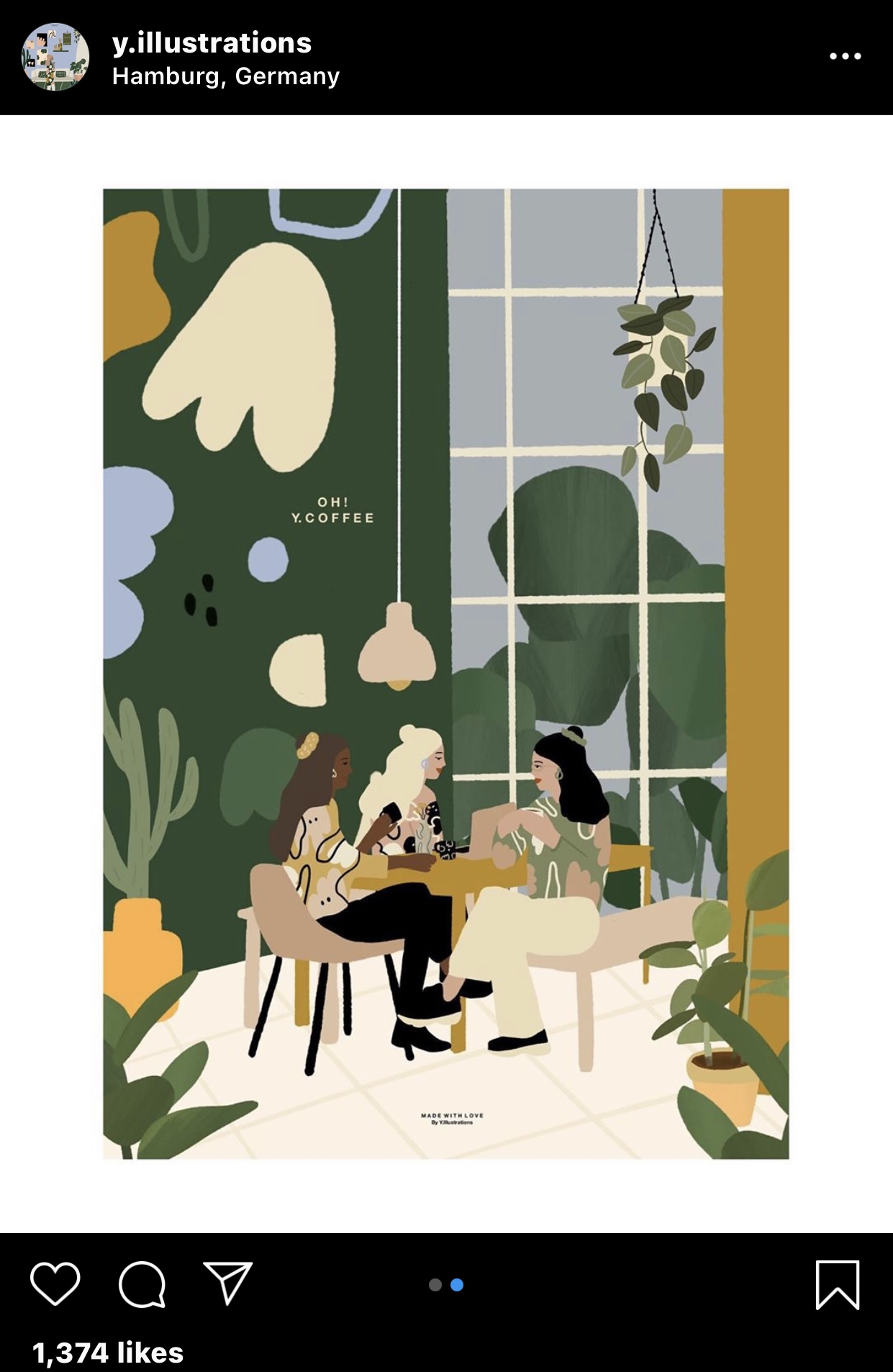
Figure 1 - Illustration by Yanii Putrii via Instagram
Here, you can observe the principles being at work through the colours and shapes. Together they create a sense of completion within this illustration like the elements all belong to one and another. This is just one of the many works I like from her.

Figure 1.2 - Prints by Ohllittlemess via Instagram
I love love love this account managed by local artist, Anis Khairina. It is so colourful and bright! Each of these prints consist of the two principles as well as variety. If you see the middle left one where there is a mixture of shapes and black lines, there is a sense of harmony through the repetition shapes. The variety is shown through the contrast of colours and lines.
ADDITIONAL INFORMATION
Proportion
'Proportion' refers to the relationship between elements in an artwork and how they compare/communicate with one another. It is really important to understand how proportion work as it can help to either enhance or diminish one's design through sizing of the elements. When the correct relationship is achieved, it produces harmony and unity.
MY WORKS
- HARMONY -

Figure 2 - Harmony using acrylic work in progress

Figure 2.1 - Harmony using acrylic work in progress
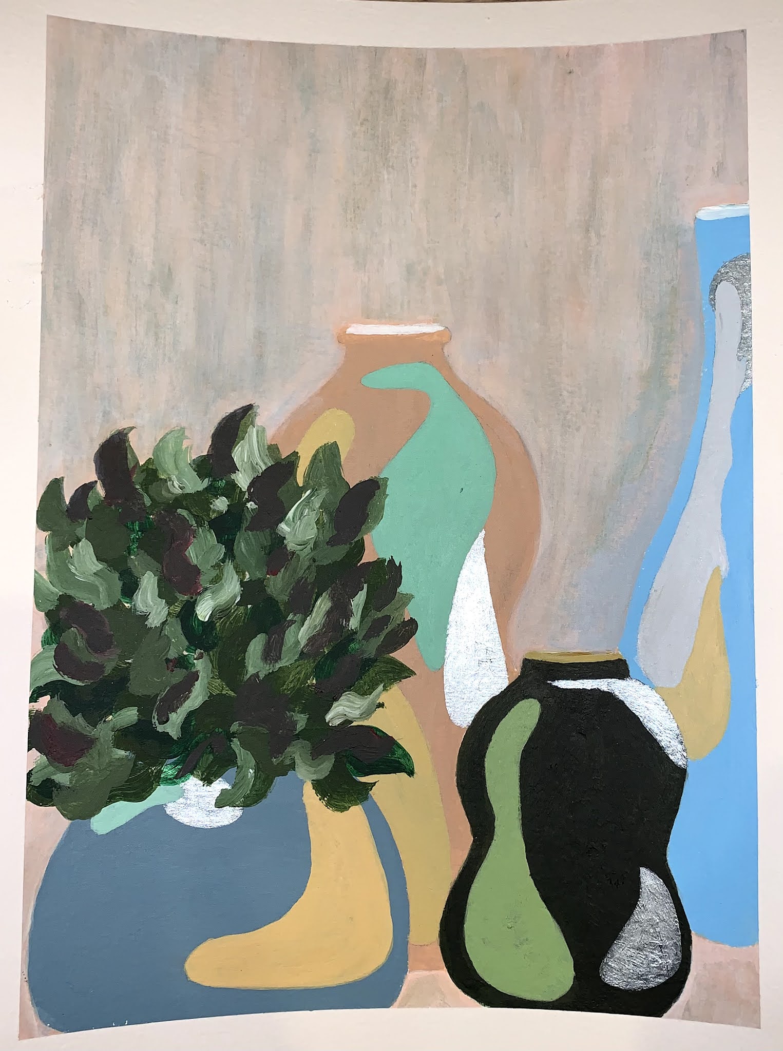
Figure 2.2 - Harmony using acrylic final piece
Frankly, I struggled with this principle as harmony and unity was overlapping in my head. I ended up painting vases. I wanted something simple yet not so simple. At first, I wanted to paint the landscape of a beach but I realise that was within my comfort zone so I went for something else entirely.
Here I stuck with a cold colour palette with hints of warmth through the yellow and peach background. I had silver and gold acrylic paint so I added hints of that too just because I like the colours.
- UNITY -

Figure 3 - Unity using acrylic work in progress

Figure 3.1 - Unity using acrylics final piece
I really love the turn out of this! It is so colourful and vibrant - exactly what I was going for. It did take a while to paint as I had to frequently change and layer colours here and there but it was so therapeutic. I got inspired by a Cinnabon because I was craving for it. Initially, I was pondering if I should add some patterns to the clothing but I realise that might be too much so I left it as solid colours.
- FEEDBACK & REFLECTION -
During our Friday class, I only showed Ms Maria the outlines of my work so it was rather difficult for her to visualize my paintings. I was very hesitant to start painting as I was feeling quite unconfident and I did not want to waste the paper, but I am quite glad they turn out the way they did. She advised me to have a clear vision of what I want my painting to look like before actually attempting it.
As for Harmony, she taught me that I should add emotion and expression towards my artwork. I felt like I did not really achieve that. If I had went with landscape, I think I would have gotten that part successfully. Overall, I really enjoyed and loved this week's exercise!
Design Principles
- Week Five -
This week we were exposed to Symbols, Imagery and Typography. It is a little bit different from our usual exercises we have done so far, more of incorporating what I have learnt previously into producing these art works below.
Symbols, Imagery & Typography
'Symbols' can be defined as a sign, shape or object that is used to represent something else. They can be used to convey information by illustrating using shapes, form, typography and further more.
There are three types of symbols as explained by Dr Jinchi

Figure 1 - Dr Jinchi's lecture slides
'Pictorial' symbols can be found in textbooks, infographics or even mind-maps. They provide simplified and image-related pictures.
'Abstract' symbols are symbols that looks like the related object they represent but with lesser details. Abstract symbols are NOT abstract art.
'Arbitrary' symbols have NO resemblance towards the ideas/objects they represent. Most of them are based on geometric shapes and colours.
Moving onto 'Imagery', this is a vital part of design. As viewers, we tend to relate and be more engage when images are correctly used to represent. Thus, it is imperative that that we use suitable and relevant images in designing.
Lastly, 'Typography' is the design and arrangement of text/words to convey a message or idea. Successful use of this will result in visual hierarchy and balance in a work of design.

Figure 1.2 - Arbitrary symbols via Pinterest
This is from the Mortal Instruments book series. These symbols are called Angelic Runes that give powers to the Shadowhunters. I really love how these symbols are as they look really unique and completely unrelated to the 'powers'. They reminded me of Chinese calligraphy but also not which made me intrigued and hooked onto the series.


Figure 1.3 & 1.4 - Collage ideas via Pinterest
As you can see, there is a vast difference between these two collages. Figure 1.3 is louder in terms of colour and vibrancy as well as the shape of the cut outs. It helped emphasize the model situated in the middle as the colours could not do that. I love how the typography helped break loud blend of colours through the neutrality of the text.
On the other hand, Figure 1.4 is more mellow and simplistic which I like. The artist, Donnie Darko, wanted to highlight the feelings of summer. It is ironic because you would expect summer to be bright and colourful but here, it is mostly monotonous with hints of red and yellow and play of textures.
MY WORKS
- SYMBOLS -
I was one of the few students who mistook the criteria as being able to use any sort of medium for our symbols art piece, but actually we are to only use any sort of digital software for our symbol art piece. Luckily, I was able to still use my 'existing mid-way completed' work. I just have to move it online. I chose Photoshop as my design medium for this exercise.
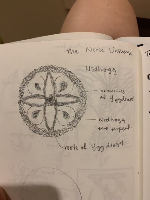
Growing up, I was incredibly fascinated by myth and legends all around the world. To read about them, admire the illustrations on books or even as far as believing them was my happy place. Hence, I wanted to create a symbol inspired by Norse Mythology. Specifically, Yggdrasil - the Universe Tree connecting all Nine Worlds. 


I am really happy at the amount of design work I have accomplished in five weeks. It really helped get the momentum going to generate new ideas and experimenting with new mediums pushing me out of my comfort zones. I never knew there was so much elements in design and it has only taken my interest further to learn and practice more. Ms Maria and Dr Jinchi has taught me a lot through their lecture and comments each week during consultation which I will implement in my future art works! I am truly grateful for this.

Figure 2 - Yggdrasil symbol in Norse Mythology via Pinterest
Guarded by the serpent, Nidhogg, in its roots,Yggdrasil is a mythical tree connecting all Nine Worlds together - symbolising wholeness and belonging. It plays a central role in Norse cosmology. With that being stated, I wanted to create an arbitrary and somewhat pictorial symbol with this.

Figure 2.1 - Sketching of Yggdrasil symbol by me
It looked quite simple so along the way I did jazz it up a little. Initially I started out with embroidery as weaving and embroidery were a big skill back in the Viking Ages.


Figure 2.2 - Figure 2.4 - Embroidery attempt by me
I played with the colours and type of braids as well. As you can see here, the green and brown are weaved in a Hungarian Chain Braid where is it tight and firm to represent the branches of the tree. Then we have the black, beige and grey threads woven together in a Basic Chain Braid to represent the versatility and thickness of the roots.
Before embroidering the serpent, I found out we were only supposed to use a digital software for this. Thus, I took a picture and upload it onto Photoshop to further ideate my symbol.

Figure 2.5 - Yggdrasil via Photoshop
Before attempting further for the serpent, I must first understand the movement of the snake and how I would want it to wrap around. I really love this snake I got from Pinterest. The way the colours complimented each other gave the snake a mysterious yet ethereal feel to it which was exactly what I hope to portray.

Figure 2.6 - Yggdrasil upclose by me
When I showed Ms Maria my progress, she found it really interesting. We both agreed that the snake I chose as my inspiration was too big so I definitely kept that in mind as I worked on the snake.

Figure 2. 7 - Attempting on serpent embroidery
I chose blue, purple and yellow for the serpent's colour as it shows a nice blend and contrast from the dull and darker tones in the background. It was braided using the Hungarian Chain Braid as well.

Figure 2.8 - Final outcome for Yggdrasil via Photoshop
The way the serpent is curled too has a meaning which I added; an infinity sign to symbolise the concept of limitless and never-ending like how the serpent constantly guards the tree by its roots.
- COLLAGE -
Here, I had two ideas as you can see below

I wanted my collage to have a deep purpose, so I chose social issues.

Figure 3 - Our Homes Are Not Dumpsters collage by me
I took the Ikea catalog home when I was out and thought I could use it for my collage. All the pictures you see here are from the catalog except for the typography which I took from the newspaper.
- FEEDBACK -
For symbol, I showed Ms Maria my digital ideation first before attempting the serpent embroidery. She found this concept really interesting and encouraged me to carry on. We both agreed that the snake from Pinterest was too thick, Ms Maria highlighted that its size hid the roots part of the embroidery. So as I did the serpent, I made sure to tighten the braids and made the body thinner. With Photoshop, I was able to enhance the colours of the serpent and added the grain effect on the background to enhance the medieval theme.
As for the collage, Ms Maria found the typography of the Perfect Family to be a little awkward. Hence, I went for the second one.
- REFLECTION -
This week's exercise took longer than expected as I did not know where to start. I just knew I wanted to experiment like how I always do with the rest of my exercises; pushing boundaries beyond what I would normally do such as embroidery. It was scary starting to embroider as it was my first time. I did not know what I was doing but with Youtube and patience, I got where I needed to be and picked up a new skill along the way. Of course, there is always room for improvement for both of these exercises but I am quite happy with the turnout considering I have never tried them before.
Comments
Post a Comment