DESIGN PRINCIPLES - WEEK SIX TO EIGHT (PROJECT 1: SELF-PORTRAIT)
Design Principles
- Project 1: Self-Portrait -
We are now done with all the exercises about design principles, and now onto our projects which we will have to incorporate what we have learned in the past five weeks. This first project will be our self-portrait. I am really excited to begin this as we have the flexibility to use whatever medium we want to express our individuality. We have two weeks to complete this exercise which gives us plenty of time to brainstorm and ideate.


Figure 1 to Figure 1.3 - Pinterest ideas of self-portraits
These are some of the ideas I explored on Pinterest to get my brain to start thinking what concepts I would be interested to either try or recreate but with my own twist. Each of these pieces express their own unique value which I appreciate. Over the years, I have done my own series of self-portraits. Most of which are just inks and lines, trying to recreate the concept of digital illustration as I did not know how to use Adobe softwares then. Now, despite having the knowledge of Adobe softwares, I find myself gravitating back towards the classic paper and art tools. That is more me, where I have better control over the textures and colours.
Before attempting, I did a lot of self-reflection. To create a purpose-filled piece, I must first understand what I want to represent: Me. As a person, there are many things I enjoy but I do not want to add too much onto my brainstorming session as it can complicate things and I can lose my sense of direction with this project.

Figure 2 - My visual board
I wanted it to be minimalistic for not just my understanding but for whoever that views this to understand as well. I chose black and white portraits of myself as reference because I believe that we humans are canvases - uncoloured and plain until inspiration strikes us. To represent that, I will use colours and textures. Before settling on the final idea, I ideate quite a bit. Just to have fun and play around to see what I like. I did not want to force an idea out, but rather just let my thoughts flow through my hands.


Figure 3 to Figure 3.2 - Step by step process of 'Quiet Thoughts'

Figure 3.3 - Final outcome for 'Quiet Thoughts'
Personally I really love this piece but it was not worthy of a project submission to be honest. I wanted to showcase how everything on the outside can be so loud and colourful all at once that it can consume my outer self. However, within, my thoughts are quiet. Hence, the contrast of colours and organic shapes vs. typography. The typography is not just any typography, it is actually my own poetry. I remembered how when I was about to sleep but my brain would just not shut off and I had this epiphany. Words started to flow out and I scribbled onto any paper I could find. There are my personal thoughts so it adds that sense of personalisation and closeness towards my viewers.
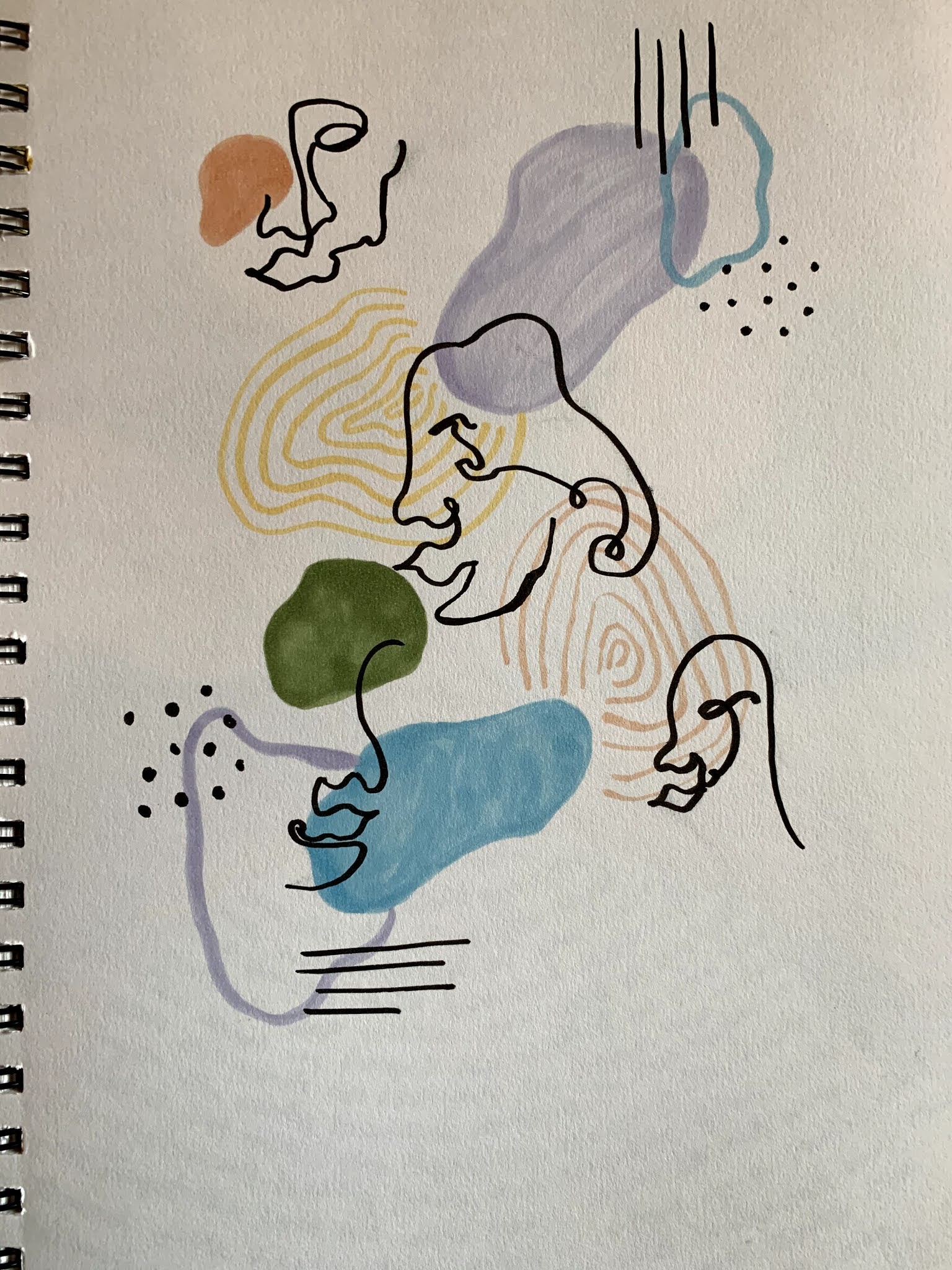

Figure 3.4 & Figure 3.5 - Organic musings
These are just drawn for fun. I remember my first time trying continuation lines with charcoal during my art classes back in high school and I loved it. It was so quirky and charming all at once. Unfortunately, it was all it was: fun. It did not really get me anywhere other than just churning out more ideas which is also great actually.
At last, I finally had an idea I feel is worthy of our project submission. Stemming from my love for writing, reading, and my enjoyment of the scent of freshly coffee, I decided to produce a mixed media piece. Not sure where to start but one way or another, I will be using coffee to paint. That was an instant decision in my head.

Figure 4 - Self-portrait sketch & planning
- FEEDBACK -
Last week (Week 7), I showed Ms Maria my progress of my final idea. She found it really interesting that I was going to use coffee to paint and suggested that I should just use a black marker to draw my facial features out. Clean, simple strokes which I heeded.
- FINAL OUTCOME -

Figure 4.1 - Final outcome for Project 1


Figure 4.2 to Figure 4.4 - Up-close details of Project 1
As you can see, I used a mixture of design principles such as Contrast, Emphasis and Repetition. The Contrast begins with the mixture of mediums used - printed pages of my favourite childhood book, coloured pencils, water colour, coffee, black marker and acrylic paint. Also, the light coat of white acrylic paint over the blouse area to show a better contrast between my skin and clothing. Emphasis comes with the pop of colours from the flowers, as well as, the typography sizes from the face and the blouse. Repetition is from the shredded pages pasted accordingly.
This piece really represents me as a person as the elements I chose to involve here has its own value and purpose. I love to read and write therefore I added the printed yellow-ish pages of my favourite book - Peter Pan. With the pages, it covered every inch of myself but there is a subtle contrast with the typography size as I wanted to show the differences between my skin and the blouse. As I enjoy the scent of freshly brewed coffee, I used espresso to paint over my "paged skin" and my hair, to darken the colours. Yes, you can actually smell the coffee still! However it was lacking depth, so I coloured my hair with shades of brown using coloured pencils. The beautiful mess of flowers and leaves hold a very special meaning as it represents my family name '叶' which means 'leaf' in Mandarin. The mess of flowers and leaves were done intentionally as nature is nature. It is organic. There is no proper way to draw/paint nature itself, just like a person. We are always changing and evolving. I used coloured pencils to create depth here as well.
- REFLECTION -
It took me so long, really extremely long to draw my facial features with the black marker. It was quite funny because of how worried I was that it would not turn out well or a wrong stroke somewhere. Those words echoed in my head for days until the last day where I had no choice but to just draw it. It turned out better than I expected!
I loved this project so much! It helped me reflect on who I am as a person and what I enjoy the most when I am myself. My individuality as a creative, I feel, reflected throughout my work but this one stood out the most to me. Also, because we were free to us whatever medium we like.
Comments
Post a Comment