Project 2B
- Self-Titled -
Week 5 (21/9/2020)
While Mr Martin introduced us to Project 2A, Mr Fauzi introduced us to Project 2B - Self-Titled. With this project, as stated by Mr Fauzi,
“Self-titled is an exploration project for the students to express their own individuality and reflect their personality into digital art self-expression. The main idea is to build up self-confidence and discover their interest.”
I was really excited to finally begin this project but I do not know where to start. Thankfully, Mr Fauzi created a template for us using Google Doc to track our weekly progress leading up to the submission week (Week 8). For the first document, we were to add in our top three inspirations from wherever. I chose Pinterest.
As described in the title, this project involves our individuality and expression. The elements I want to include must have a meaning/purpose in my life. With that in mind, I was thinking of making my own portrait black and white symbolising simplicity, quietness and also somewhat a blank canvas. There’s just something about black and white portraits that brings up a certain perspective of a person as it blocks out the colours of their clothes/surroundings. Black and white just directs your eyes to the face and their expression.
I was thinking of adding colourful/textured elements to highlight my personality and what I like/influenced with. I love eggs, so I would definitely add that in somehow. The colours of teh tarik/english breakfast tea with milk, mauve, edible gold(the texture plays a role), and greens. Book pages of my favorite lines here and there, maybe art as well. I probably won’t add all of them, I just want to keep it simple and not ‘in-your-face’. Frankly, describing ideas has not been my forte. Thus, I will speak through my selected inspirations.
Inspiration 1:
I like how the colours were kept to a minimum with the opacity and shapes. I noticed they used primary colours as well; complimenting one another and the red helped emphasise. However, I did not like how her face is mostly covered by the flower as I feel like the eyes or the face in general will speak more.
One of the lessons I’ve learned from the past composition exercises was that less is more. Hence, I really don’t want to overdo my self-titled project. This composition, to me, seems balanced and nea
Inspiration 2:
I love this! Despite her face being covered, they were replaced or covered with ‘lookalikes’ such as the drawing of the eye and the red lips. This ad combined realism with line art that creates a subtle yet noticeable contrast. The cursive words are organic and feminine with the twirls and all which compliments the portrait. The pink, red and touch of gold brightened up the flatness of the girl’s pose.
Inspiration 3:
I love this too! The textures and colours here stood out to me the most. The portrait is not necessarily black and white but the saturation made her fit into the overall colour theme of the graphic which I like. It’s almost teasing. The simplicity of the elements and cuts combined with the faded colours and textures made this so effortless and easy to understand. I hope to blend textures as such onto my self-titled project.
Inspiration 4:
How can I not include this? Like I said, I love eggs so this is definitely here. You can fry them, steam them, bake them, and it still tastes really good. It’s really so simple and just all in all random which I love. It does not look like it has a heavy purpose, but more of playing with the mustard colour matching the yokes onto a couples face. There is a sense of harmony here with the colours - tying the graphic as a whole.
Mr Fauzi enjoyed the way I presented my ideas as I had a reason and purpose behind the elements of my choosing. However, he did highlight how the compositions or the direction I was going for resembles a painting rather than a graphic. Hence, I should expand more and look for more graphic-like inspirations.
Week 6 (28/9/2020)
As for this week's progress check, we were given a different type of Google Doc. This time, Mr Fauzi compartmentalised for us the type of design aspects we would want to include into our self-titled project.
We had to include about 50% of our work done inside each section. So before building our composition, we had to figure out what elements we want to include. These are mine:
PHOTOGRAPHY OF YOURSELF:


Eventually I will tweak the exposure of the picture as I feel like the background is a little too dark.
A page from one of my favourite childhood book
Pictures of Hong Kong that I wished to include somehow as HGK has a special place in my heart, as well as my love for cityscapes.
TYPOGRAPHY DESIGN:


A design I made from my Chinese name. I’ll probably try other variations of this just to experiment and see what fits the best.
After showing Mr Fauzi what I have during our class today, he suggested that I pick the first portrait photo that was taken. He shared his idea on how I do not need too much elements to compliment my portrait, if not it will complicate it and takes the emphasis away from the face. Lastly, he mentioned how this could look like a movie poster and I thought that would be quite a creative idea as my Chinese name would make it seem like an old, Shanghai movie poster. Of course with other editing/elements as well.
With all that being stated, Week 7's progress check would be 80% done. Since we have done 50% there about, we just need to add 30% more.
Week 7 (5/10/2020)
50% Progression:
Figure 2 - 50% Progress
Description:
With the feedback I received, I started to attempt my first draft of self-titled and it really did not go as planned. I felt lost despite knowing who I am as a person. It was just that I do not know how to convey that into my composition. I experimented with different concepts to see what I liked/resonate with the most. This was the only one I was semi-happy with. I like the mustard yellow/egg yolk colour and with that in mind, I found other colours to compliment that. Using the yellow as an emphasis colour. I also added pictures of my trip to Hong Kong.
Feedback from Mr Fauzi from the previous week after presenting him the elements:
As Mr Fauzi reviewed my 50% progress, he mentioned how the first portrait was better to use in my self-titled. Also, I shouldn’t add too many elements to my composition as it would take away the emphasis of my b&w portrait. He suggested that I could go with the movie poster concept which I took under consideration.
80% Progression:
Figure 2.2 - 80% Progression
Description:
Here, I would say I had better flow as to where I’m going. I love the vintage looks and I recreated it here with the play of textures(noise - gaussian). It resembles more of a scrapbook where I would keep my most cherished memories. So the typography I added was scribbled by me quoting Peter Pan but I changed a word or two to suit the feelings I wanted to convey - adventure, amazement, almost cinematic-like and excitement. I used Procreate to write as I really really wanted to have that organic and personal touch to my composition. Evidently, I didn’t add the egg because I didn’t know where I should add the egg. As I look at this composition as a whole, I feel like it’s more me and it represents me as a person.
Week 8 (12/10/2020)
This week is independent learning week so there was no classes throughout but Mr Fauzi was kind enough to provide us our feedback towards our 80% progression check. He did so by sending us a screen-recording of him advising us ways to further improve our Project 2B - playing around with filters and colour correction.
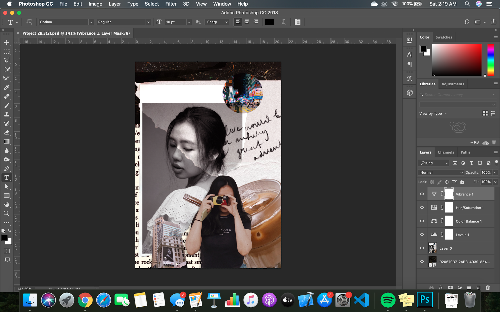
Figure 1 - Project 2B
After watching the video, I played around with the filters and colour correcting towards my whole composition as Mr Fauzi highlighted that most of our composition elements do not match with one another. So it looks like we just mixed and matched a bunch of different pictures together. To make it look like a whole/balanced, I played with the Hue/Saturation, Colour Balance, Levels and Vibrance. I think my composition looks so much better with the changes. There is a hint of purple-ish red that matches with the circle city picture on the top right.
Week 9 (19/10/2020)
Once we were confident with our final composition for Project 2B, we can hand it in. I feel like mine was completed and I did not want to add anymore elements to complicate the look. I just tweaked the filter to make it look balanced, as well as, the straw on the glass. I realised that it was not selected properly before masking.
Figure 1 - Final Outcome for Project 2B
Overall, I really like the turnout. It represents me as a person and my personality. Frankly, the difficult part about this project was my self-reflection; understanding what I like and dislike and reflecting that onto the digital canvas.


Comments
Post a Comment