DESIGN PRINCIPLES - WEEK EIGHT TO TEN (PROJECT 2: SENSE OF PLACE)
Design Principles
- Project 2: Sense of Place -
As for our second project, we are to observe our surroundings - the feelings evoked, our perspective, our interpretation towards our surroundings. With the CMCO being implemented again, there really is not anywhere we can go to have a change of scenery. There were a lot of places running through my head that I felt sentimental and emotionally attached to, but those were the past. My feelings then may not be as strong as before. Hence, the art piece may not portray exactly how that feeling is supposed to be.
With everything that is going on in the world at this moment, it is so easy to get overwhelmed with negativity and sadness. Everything I see on social media and media in general is so repetitive. Static even.
In my piece, I wanted to highlight the life and light in my surroundings. So I decided to focus on my garden and its details. There is still life growing, and breathing quietly all around us amongst the loudness of the world.
For this project, I did not do much research online. I was spending time in my garden, and taking pictures of what I like:
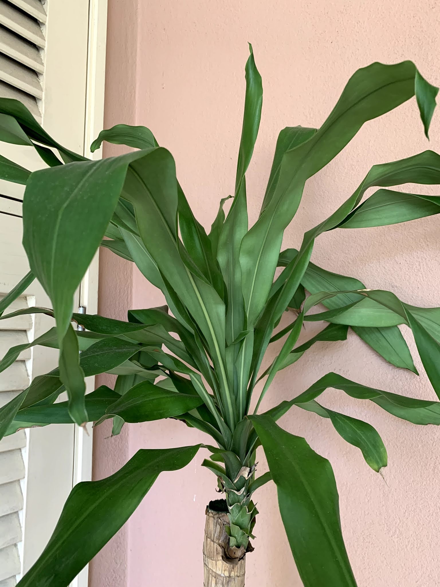


Figure 1 to Figure 1.6 - Plants in my garden
I was debating if I should produce a digital piece or a collage instead, but I decided to just ideate with markers first. Get what I see in my head down onto paper to get a proper visualisation.


Figure 2 to Figure 2.1 - Sketchbook ideation using markers

Figure 3 - 'My Sanctuary' or 'Garden' ideation drawn by me via Procreate
On Week 9 (23/10/2020) , we had our first consultation which I showed Ms Maria what I had so far. She really liked that I was going for the digital approach and suggested that I create this digitally instead. However, this piece above did not show the sense of place. It's quite abstract, yes, but it does not visualise the place. Hence, Ms Maria showed me previous works from my seniors to help me get a better idea on how I should approach this project. After reviewing my seniors' work, it gave me a better idea/perspective on how to portray my sense of place better.
In the next week, I decided to try out different perspectives and elements.

Figure 4 - Digital sketch 1
I just had fun with it which is ultimately one of the feelings I wanted to portray. The contrast of yellow and blue is really pretty and striking so I wanted to include that somehow. The elements in the blue part will show 'cold' and 'numbness' but wherever the sunlight shone, there is life and colour. Kind of showing that we humans are like plants too. With the CMCO, we need sunlight for our well-being and sunlight has been proven to do our bodies and mind good.
However, I felt like this piece was too up-close so it could not really show the sense of place. I really enjoyed the blend of colours though. Hence, I created another piece.

Figure 4.1 - Digital sketch 2
I really like this. The blend and subtle contrast between the colours and shapes show harmony with one another, creating a peaceful sense of place. The gentle sunlight flooding through the windows are inspired from my own living room where the morning light hits just right, greeting the house with a warm glow to the start of a new day.
On Week 10 (30/10/2020) during my consultation with Ms Maria, I presented her with these two pieces and she really liked the second one. She said that it showed the sense of place and the feelings that come with it. She too enjoyed the first one as it showed a good combination of colours, however, the sense of place does not come off as strong as the second on. Her only comment regarding the second piece was the plant on the most left which I agreed. It seemed too solid and somewhat 'serious' for such a bright setting. Also, the left wall, the off-white colour resembled a bright white. I heeded her comments and made the changes to improve my work further.

Figure 5 - Sense of Place final piece
REFLECTION
Like the previous project, I really enjoyed this as well. I have never been good at conveying my idea of a place into an art piece so this was a good challenge for me as an aspiring creative. It helped me familiarise around Procreate as well. Procreate used to look so intimidating, but with practice, I was able to produce artworks that I really like. This really shows that art comes better when you have a purpose/value to start with and to have fun while producing it.

Comments
Post a Comment