DIGITAL PHOTOGRAPHY & IMAGING - WEEKLY UPDATES (IN DETAIL)
DIGITAL PHOTOGRAPHY & IMAGING
- Week One -
PRACTICAL
1. CHIN CHAI KOPITIAM - a hypothetical restaurant branding by Kristin Soh


2. SWING KIDS - new poster release for a Korean movie

3. SHOULD I STAY OR SHOULD I GHOST? - graphic by Viktor H Studios

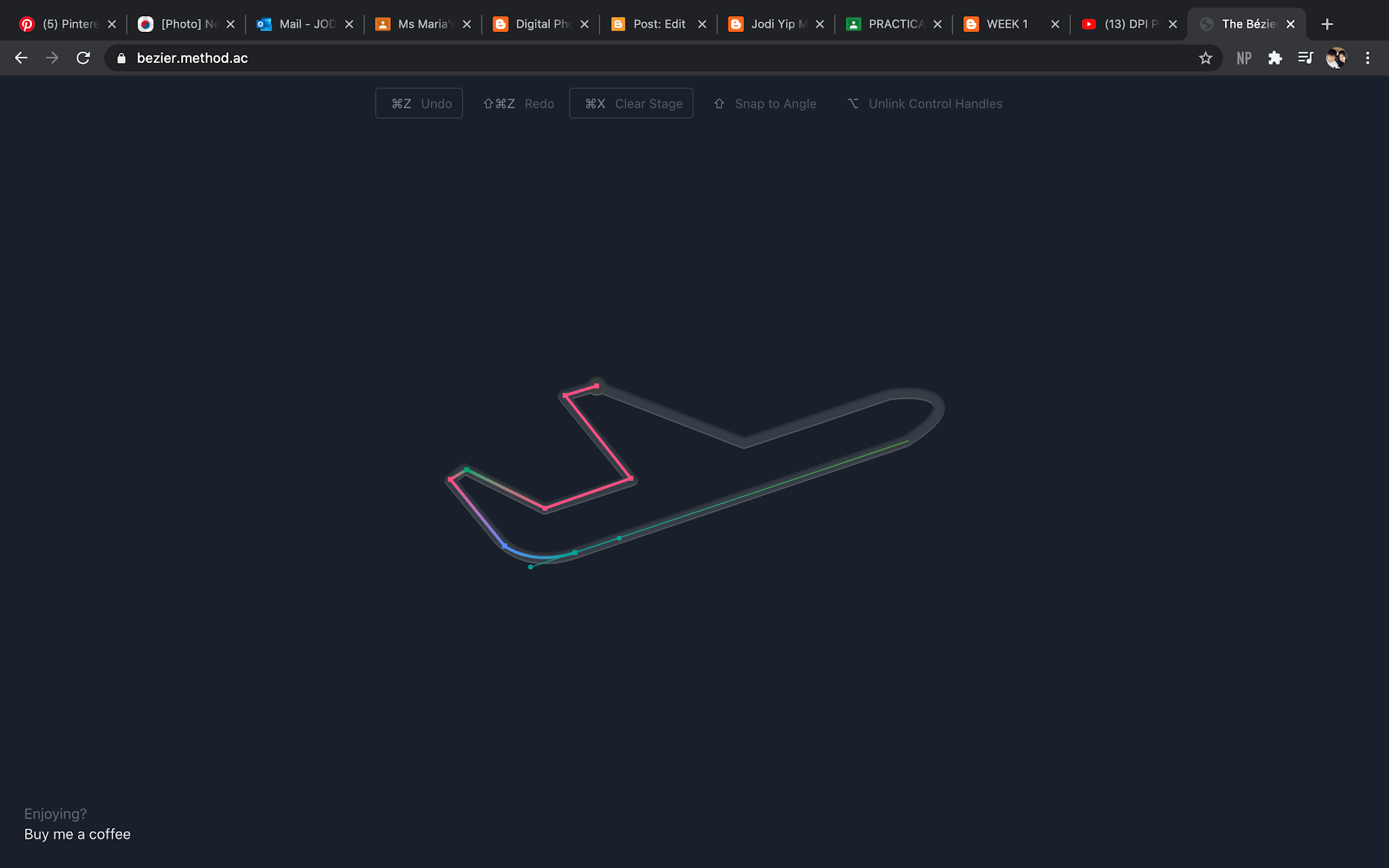
THE BEZIER GAME EXPERIENCE
HEARST MANSION EXERCISE


LECTURE


TUTORIAL
Digital Photography & Imaging
- Week Three -
There was no class last week(Week two) as it was the 31st of August, Malaysia's Independence day.
After our lecture with Mr Martin, Mr Fauzi introduced to us our second lesson of photoshop involving Double Exposure & Image Blending Mode. It was quite fascinating to understand the journey behind merging two or more pictures together to create a whole new picture.
PRACTICAL
We were tasked with more practice work on photoshop. This time involving blend modes and gradient.
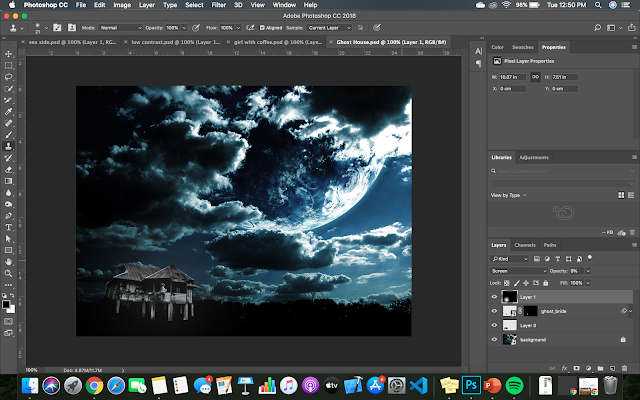
Figure 1 - Ghost House

Figure 1.2 - Girl with Coffee Steam

Figure 1.3 - Birds on Sunset

Figure 1.4 - Portrait
These exercises were fun yet a little confusing as I have never dealt with blend modes or gradient before. Not this way at least so it was a really great advancement in my Photoshop skills. I cannot wait to see what else I can do with these properties.


LECTURE
To begin with, we were tasked with:- Picking our three favourite Double Exposure Photography technique from the slides and explain why
1. MAKE SIMPLE OBJECTS LOOK FASCINATING

Figure 2 - via DPI slides
This was on the 10th slide and I fell in love with stars illuminating the dark silhouette of the buildings at the back. It gave it an imaginative concept where anything was possible. Almost a cinematic feeling of such a dynamic galaxy can be placed inside the silhouette of the buildings.
2. WORK WITH SILHOUETTE

Figure 2.1 - via DPI slides
The next favourite would be working with a silhouette. Mainly because its simple yet and endless array of possibility. It helps give a shadow a character of its own whether if it is a forest or oceans.
3. TILT SHIFT

Figure 2.3 - via DPI slides
Lastly, the tilt shift. This effect stood out to me as it was quite alluring. It created this almost hazy, translucent effect that adds definition and motion to the object. Aside from character, this effect does bring to life one's artwork .
TUTORIAL
From our recent lecture of double exposure, we were tasked to create three composition pieces using the images provided in the Google Drive. For all three pieces, we were to use the same design elements.
 Composition 1
I felt this was pleasing to the eye yet it was too easy and simple. It was missing other elements which I added later on. I used 'Difference' and 'Hard Light' blend modes.
 Composition 2
Experimented more on the placement and blending. Still feels off, this piece looked so out of proportion and separated to me. I also used 'Hard Light' here as I felt like it gave a nice contrast and blend to my work.

Composition 3
Ended up liking this piece as it felt closed and complete. I used 'Luminosity' and 'Multiply' here to blend. I enjoy the sudden burst of colours here and there.
I really really enjoyed this tutorial task by Mr Fauzi! I actually did more than these few using other elements and experimented with other blend modes. However, I felt that I was still stuck in my safe zone in designing; always looking for ways to stay within my boundaries. With future exercises as such from my lecturers, I hope to explore more as an aspiring creative and create great art works.


Digital Photography & Imaging
- Week Four -
PRACTICAL
For this week's class, we looked more into the different blending modes. Mr Martin tasked us a new assignment - colourize a black and white image! At first, I was afraid because it sounded like there was not an easy task but it turned out super fun and therapeutic.

Figure 1 - Mr Martin's example done by me
Prior to this, he went over the previous task once more - Ghost Mansion, Coffee Steam & Birds in Sunset. We had to complete another blending practical for this which was the cowboy.

Figure 1.2 - Cowboy
As for the black and white practical, I chose Willow Smith.

Figure 1.3 - Willow Smith
Frankly, I forgot to add some of the layers as I went along but it turned out alright. I will try to remind myself as I go along in the future. This was really therapeutic to do as I did not have to think so much while doing, so it was a stress reliever.


LECTURE
As for lecture, we continued to learn about how we can match lighting, adjust layers and filters to make our work even more interesting and for some instances, life-like.
Through these adjustments(& masking), we are able to have more control and customization on certain areas of our work; bringing our visions to life.
It can get confusing when it comes to layering & masking if we are not attentive, but once you are in the zone, it gets fun watching your work come together.
TUTORIAL
This week's tutorial task is similar to last week's. We are to compose three new compositions from the new selections given.
Mr Fauzi emphasized about planning out our designs before execution as it would help us create a clear picture and flow for our compositions. We are to focus on concepts this week from our compositions.
Composition 1:

After our tutorial, I went into planning mode as Mr Fauzi stressed the importance of planning before execution. Frankly, nothing came out as I planned. Reason being, as I went along, more ideas came into play and I just went along with it. It turned out even better than what I initially planned. Although that happened, the planning did help getting the designs to start somewhere.
One thing I did know was that the concept of these compositions would highlight ‘Different Worlds’ or ‘What Ifs’.
Here, I wanted something psychedelic and tie-dyed like, so the main emphasis, as you can see here, are the lines. I call this ‘Chaotic Calmness’ since the astronaut seems calm amidst all the “chaos” around him/her.
Composition 2:

In my second composition, I wanted to play around with the silhouette by creating a dystopian-like world. Similarly to the first composition, I did a lot of layering of the same image to create depth and contrast(tried to). I had two other variations of this piece, but I decided to go with this one.
This piece is quite straight to the point where the astronaut and the girl discovered a whole new universe inside the moon.
Composition 3:

I felt like my creative juices were running out as I proceeded to the last composition. It did take me a while to come up with another design using the same elements. Here, I wanted to showcase the concept of alternative universes. Things may be the same yet so very different and all is connected.

After our tutorial, I went into planning mode as Mr Fauzi stressed the importance of planning before execution. Frankly, nothing came out as I planned. Reason being, as I went along, more ideas came into play and I just went along with it. It turned out even better than what I initially planned. Although that happened, the planning did help getting the designs to start somewhere.
One thing I did know was that the concept of these compositions would highlight ‘Different Worlds’ or ‘What Ifs’.
Here, I wanted something psychedelic and tie-dyed like, so the main emphasis, as you can see here, are the lines. I call this ‘Chaotic Calmness’ since the astronaut seems calm amidst all the “chaos” around him/her.
Composition 2:

In my second composition, I wanted to play around with the silhouette by creating a dystopian-like world. Similarly to the first composition, I did a lot of layering of the same image to create depth and contrast(tried to). I had two other variations of this piece, but I decided to go with this one.
This piece is quite straight to the point where the astronaut and the girl discovered a whole new universe inside the moon.
Composition 3:

Digital Photography & Imaging
- Week Five -
PRACTICAL
This week, Mr Martin gave us more blending and recolouring exercises to complete. I did not realise that I went ahead of myself and did a recolouring exercise on my own of Willow Smith but it is alright. I did another recolouring exercise to practice my brush accuracy of blending and tried to get use to layering.
In class, he showed us an in-class exercise on how to layer with select and mask to produce a seamless recolouring exercise.

Figure 1 - This week's recolouring exercise of Lupita N'yong
Unlike last week's brush recolouring, Mr Martin taught us to utilize 'Select & Mask' to improve on our accuracy. Especially on stray hairs which is harder to recolour using a brush. It got confusing when it came to 'Select & Mask' as I was not used to it but with practice, I got the hang of it.

Figure 2 - Displacement exercise in progress
Apart from the recolouring exercise, we were asked to attempt a displacement exercise using the images provided by Mr Martin on Google Drive. First with the Liverpool flag then with our Malaysian flag. This was so satisfying to so do once you understand 'Select & Mask' and the brush tool.

Figure 2.1 - Final outlook of the displacement exercise
We were then tasked with our next project - Project 2B Cyborg. Mr Martin requested for either a Google Slides/Google Doc of our ideation.


Figure 2.2 & Figure 2.3 - Cyborg Ideation


LECTURE
This week's lecture, we learned about Exposure - Aperture, Shutter Speed, and ISO.


Figure 2.4 to Figure 2.7 - Lecture slides


TUTORIAL
In this week's tutorial, Mr Fauzi tasked us with ideating our Self-Title project through Google Classroom.
As described in the title, this project involves our individuality and expression. The elements I want to include must have a meaning/purpose in my life. With that in mind, I was thinking of making my own portrait black and white symbolising simplicity, quietness and also somewhat a blank canvas. There’s just something about black and white portraits that brings up a certain perspective of a person as it blocks out the colours of their clothes/surroundings. Black and white just directs your eyes to the face and their expression.
I was thinking of adding colourful/textured elements to highlight my personality and what I like/influenced with. I love eggs, so I would definitely add that in somehow. The colours of teh tarik/english breakfast tea with milk, mauve, edible gold(the texture plays a role), and greens. Book pages of my favorite lines here and there, maybe art as well. I probably won’t add all of them, I just want to keep it simple and not ‘in-your-face’. Frankly, describing ideas has not been my forte. Thus, I will speak through my selected inspirations.
Inspiration 1:

I like how the colours were kept to a minimum with the opacity and shapes. I noticed they used primary colours as well; complimenting one another and the red helped emphasise. However, I did not like how her face is mostly covered by the flower as I feel like the eyes or the face in general will speak more.
One of the lessons I’ve learned from the past composition exercises was that less is more. Hence, I really don’t want to overdo my self-titled project. This composition, to me, seems balanced and neat.
Inspiration 2:
I love this! Despite her face being covered, they were replaced or covered with ‘lookalikes’ such as the drawing of the eye and the red lips. This ad combined realism with line art that creates a subtle yet noticeable contrast. The cursive words are organic and feminine with the twirls and all which compliments the portrait. The pink, red and touch of gold brightened up the flatness of the girl’s pose.
Inspiration 3:

I love this too! The textures and colours here stood out to me the most. The portrait is not necessarily black and white but the saturation made her fit into the overall colour theme of the graphic which I like. It’s almost teasing. The simplicity of the elements and cuts combined with the faded colours and textures made this so effortless and easy to understand. I hope to blend textures as such onto my self-titled project.
Inspiration 4:

How can I not include this? Like I said, I love eggs so this is definitely here. You can fry them, steam them, bake them, and it still tastes really good. It’s really so simple and just all in all random which I love. It does not look like it has a heavy purpose, but more of playing with the mustard colour matching the yokes onto a couples face. There is a sense of harmony here with the colours - tying the graphic as a whole.
As described in the title, this project involves our individuality and expression. The elements I want to include must have a meaning/purpose in my life. With that in mind, I was thinking of making my own portrait black and white symbolising simplicity, quietness and also somewhat a blank canvas. There’s just something about black and white portraits that brings up a certain perspective of a person as it blocks out the colours of their clothes/surroundings. Black and white just directs your eyes to the face and their expression.
I was thinking of adding colourful/textured elements to highlight my personality and what I like/influenced with. I love eggs, so I would definitely add that in somehow. The colours of teh tarik/english breakfast tea with milk, mauve, edible gold(the texture plays a role), and greens. Book pages of my favorite lines here and there, maybe art as well. I probably won’t add all of them, I just want to keep it simple and not ‘in-your-face’. Frankly, describing ideas has not been my forte. Thus, I will speak through my selected inspirations.
Inspiration 1:

I like how the colours were kept to a minimum with the opacity and shapes. I noticed they used primary colours as well; complimenting one another and the red helped emphasise. However, I did not like how her face is mostly covered by the flower as I feel like the eyes or the face in general will speak more.
One of the lessons I’ve learned from the past composition exercises was that less is more. Hence, I really don’t want to overdo my self-titled project. This composition, to me, seems balanced and neat.


Digital Photography & Imaging
- Week Six -
PRACTICAL
Following the previous week, Mr Martin tasked us with another displacement task of our own choosing but only using animals. 
Figure 1 - Week six task via Google Classroom

Figure 1.2 - Zebra Dolphin Displacement by me
Initially, I chose a grey seal and cheetah skin but that was quite difficult to accomplish due to the colours and shadows. I could not displace it well. Hence, I decided to go for a dolphin that has a clearer background and zebra skin.
Next, we were to include photographs for our Cyborg project (Project 2A) according to our sketches.


Figure 2 - Figure 2.1 - Self-Photography for Project 2A


LECTURE
We were exposed to a simplified zone system for making good exposure: A Simplified Zone SystemThis was quite technical and hard to understand if we are to just learn it theoretically, so some practice must be done through our photography in the future.
These zones often refer to the value of a certain colour.

Figure 3 - Zone System

TUTORIAL
During tutorial, we were having given another individual consultation regarding our second project - Project 2B (Self-Titled) following from the previous week. This time, Mr Fauzi compartmentalised for us the type of design aspects we would want to include into our self-titled project. We had to include about 50% of our work done inside each section. So before building our composition, we had to figure out what elements we want to include. These are mine:


Figure 4 - Figure 4.1 - Week six's progress check
Mr Fauzi was quite happy with the work so I was allowed to begin my project. He suggested that I could turn my composition into a movie poster which I find quite interesting. Hence, I will probably pursue that idea. He has tasked us with the next Google Doc progression check. Next week, we must be at least 80% done, meaning since I already have about 50% done here, I just need to add 30% or more.


Digital Photography & Imaging
- Week Seven -
PRACTICAL & LECTURE
As for this week's practical, Mr Martin went through with us our previous exercises to see if there was room for improvement. He went through the Hearst Mansion as well as the Cowboy/Haunted House exercise. I did not realise then but after he evaluated these exercises from my course mates, I realised mind needed improvement too. Specifically, colour matching. Once I was done, I just resubmitted them accordingly.

Figure 1 - Cowboy/Haunted House revamp

Figure 1.2 - Hearst Mansion revamp


TUTORIAL
We were given another progression check through Google Docs which we were tasked to include our 50% progress(+ feedback and our description) and our 80% progress(+ our description).
50% Progression:

Figure 2 - 50% Progress
Description:
With the feedback I received, I started to attempt my first draft of self-titled and it really did not go as planned. I felt lost despite knowing who I am as a person. It was just that I do not know how to convey that into my composition. I experimented with different concepts to see what I liked/resonate with the most. This was the only one I was semi-happy with. I like the mustard yellow/egg yolk colour and with that in mind, I found other colours to compliment that. Using the yellow as an emphasis colour. I also added pictures of my trip to Hong Kong.
Feedback from Mr Fauzi from the previous week after presenting him the elements:
As Mr Fauzi reviewed my 50% progress, he mentioned how the first portrait was better to use in my self-titled. Also, I shouldn’t add too many elements to my composition as it would take away the emphasis of my b&w portrait. He suggested that I could go with the movie poster concept which I took under consideration.
80% Progression:

Figure 2.2 - 80% Progression
Description:
Here, I would say I had better flow as to where I’m going. I love the vintage looks and I recreated it here with the play of textures(noise - gaussian). It resembles more of a scrapbook where I would keep my most cherished memories. So the typography I added was scribbled by me quoting Peter Pan but I changed a word or two to suit the feelings I wanted to convey - adventure, amazement, almost cinematic-like and excitement. I used Procreate to write as I really really wanted to have that organic and personal touch to my composition. Evidently, I didn’t add the egg because I didn’t know where I should add the egg. As I look at this composition as a whole, I feel like it’s more me and it represents me as a person.
Apart from our Self-Titled Project, Mr Fauzi presented a video to us about Design Theory which I have embedded here: Design Theory: How To Make Dynamic Compositions
With this video, the artist has shown us various ways to enhance the user's experience through visual design. Some of the principles may seem simple and mundane but they add a world of a difference when taken as a whole. Here, the artist has proven that by using just size and colour, they can help create the principle of Contrast. With contrast, that can also lead to Emphasis. I was also exposed and practised these principles in my Design Principles class so it was much easier for my to grasp.

As Mr Fauzi reviewed my 50% progress, he mentioned how the first portrait was better to use in my self-titled. Also, I shouldn’t add too many elements to my composition as it would take away the emphasis of my b&w portrait. He suggested that I could go with the movie poster concept which I took under consideration.
80% Progression:

Digital Photography & Imaging
- Week Eight -
TUTORIAL
This week is independent learning week so there was no classes throughout but Mr Fauzi was kind enough to provide us our feedback towards our 80% progression check. He did so by sending us a screen-recording of him advising us ways to further improve our Project 2B - playing around with filters and colour correction.

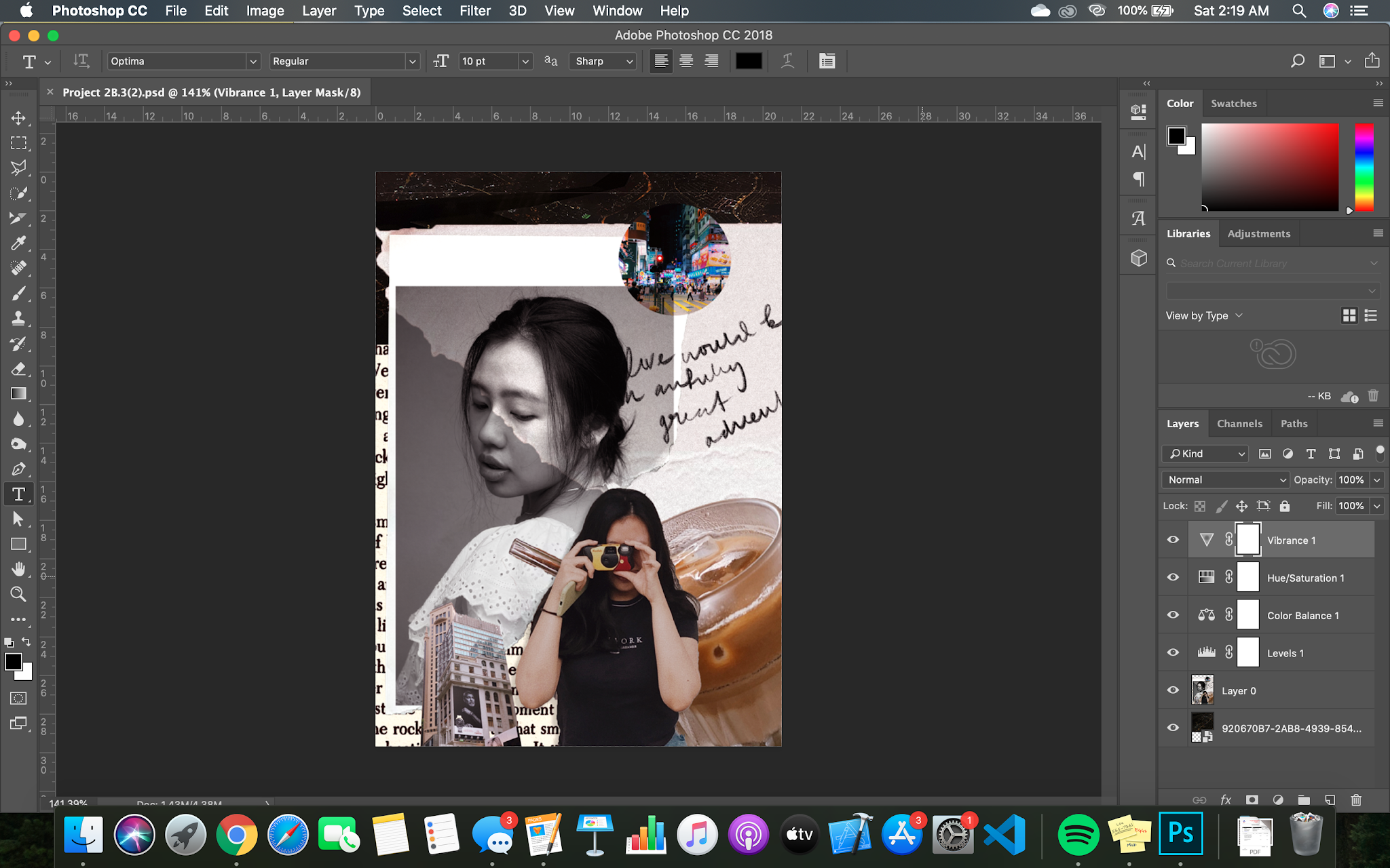
Figure 1 - Project 2B
After watching the video, I played around with the filters and colour correcting towards my whole composition as Mr Fauzi highlighted that most of our composition elements do not match with one another. So it looks like we just mixed and matched a bunch of different pictures together. To make it look like a whole/balanced, I played with the Hue/Saturation, Colour Balance, Levels and Vibrance. I think my composition looks so much better with the changes. There is a hint of purple-ish red that matches with the circle city picture on the top right.
Digital Photography & Imaging
- Week Nine -
LECTURE
This week's lecture consist of the necessary skills needed for us to begin Project 2A - Humanoid/Cyborg. It does seem intimidating when looking at the slides, complicated even, but with Mr Martin's guidance we managed to complete the first step.


Figure 1 & 1.1 - Lecture slides for Humanoid/Cyborg Project 2A
Apart from this, Mr Martin also went through our previous submitted exercises to evaluate them with us. By doing so, he gives us a chance to further improve or alter our work for better understanding and observation.
I had to redo my recolouring exercise as Mr Martin felt as though the hair part was not done well. Personally, I disagree because the hair was supposed to be that way as I saw in her coloured picture. I think it is because of the light pink-peachy background that I changed to as light backgrounds show more detail compared to dark ones, or because her hair still looked black and white. Anyways, I did redo it as I think it helps me improve better and resubmitted it.

Figure 2 - Recolouring exercise resubmit


PRACTICAL
As for practical class, Mr Martin walked us through a short photoshop session of adding a cyborg limb onto a model. He also taught us how to emboss, shadowing and stamping. Shadowing interact a lot with lighting and where the light source is coming from. If that is not identified, the shadow will look awkward and obvious. The touch of shadowing and highlighting helps with realism.


Figure 1 to 1.1 - Bora Humanoid by me
Even though this was a in-class exercise, I prefer to do it after Mr Martin's class. Reason being, I focus better and I can control the rewind video. While he does the demo, I would listen and observe the way he completes the demo. Also, swiping my screen constantly hurts my eyes. If I use my phone for the Zoom call, it is too small to notice details.


TUTORIAL
In today's tutorial, Mr Fauzi introduced us to our final project - Surrealistic Parallax. It involves all that we learned throughout the semester and some new elements which he will teach us along the way. After this week, we will be going full-speed ahead. Despite the pilling of assignments from all of my modules, I'm quite excited to complete these projects. Mr Fauzi showed us some of our seniors' work to give us some idea and inspiration on how to tackle ours.
Surrealistic Parallax ultimately means a wonderful dream, or an incongruous imagery (unnatural, irrational combinations).

Figure 1 - Seniors' Work on Mr Fauzi's website
To produce this, we need to acquire After Effect and Premier Pro skills. After Effect enables us to animate the elements within our composition, making them even more interesting as it reinforces the sense of surrealism. Premiere Pro is when we wish to add some sort of audio. I have never tried After Effects before, so this is going to be a challenge for me.

Digital Photography & Imaging
- Week Ten -
LECTURE/PRACTICAL
For this week's lecture, we continued with another in-class humanoid demo of a Geisha. Mr Martin walked us through the new steps to get us accustomed. As usual, he provided slides with the steps so we can refer, as well, as a recorded video.

Figure 1 - Slides from Mr Martin
After the demo, Mr Martin went over more of our exercises like last week.
This is my version of the geisha humanoid:

Figure 1.2


TUTORIAL
With Mr Fauzi, he showed us the basics of After Effects for our Final Project - where our tools are, how to animate, how to add audio using Premiere Pro.


Figure 2 to Figure 2.3 - Mr Fauzi's After Effects/Premiere Pro class
Frankly, I was having a hard time grasping throughout the class. Mainly because everything was so foreign and new to me, and After Effects looked so intimidating with its properties. After Effects did look similar to Adobe Animator which I am some what familiar with as I took Innovative Media last semester, so learning this should not take too long.
Mr Fauzi made it look so simple and easy while he edited his composition. Hopefully, when I attempt mine, it will be as easy and fun. Once the demo was done, he reassured us that this recording will be uploaded for us to rewatch whenever we need. He then tasked us with our Final Project - Surrealistic Parallax composition to be at least 50%-70% completed by this Friday before midnight, as well as, our Project 3 - E-blog at 4pm.
Right after, I went over to Pinterest to get some ideas on how I want my composition to look or resemble. I do not want anything too much, just simple yet strange movements following the theme of surrealism.


Digital Photography & Imaging
- Week Eleven -
LECTURE/PRACTICAL
We are nearing our deadline for our Humanoid/Cyborg Manipulation Project, so today's class consisted of Mr Martin reviewing our 70% work done of our Project 2A:

Figure 1 - Humanoid
Once I did all I could within Week 10, I presented my work to Mr Martin on Week 11 along with my other course mates. I was one of the first few so the comments came pretty fast. Mr Martin really liked my overall look and concept. His only suggestion was to further blur the background and desaturate it to make my humanoid stand out, as well as, making my skin more synthetic like. I agreed and explained that I was more focused to creating the details on my humanoid first.
After heeding his comments and his comments for my course mates, I went to revamp mine to (hopefully) be better. Submission is next week on Week 12 (9/11/2020) so I had to get to work.

Figure 1.2 - Humanoid Official
I had a really hard time masking the hair because my Photoshop kept lagging when I went into 'Select and Mask' mode. Hence, I had to use my friend's laptop, and a bit of his help to teach me the best way to mask my hair properly. It took quite some time but I managed to complete it - masking my hair properly, blur and change my background, and desaturated my skin.
Overall, I really like the turnout of this project and I have learned so much from just a few lessons. Mr Martin even gave a list of Youtube tutorials for us to get inspired from on Google Classroom:
Synthetic skin design:
https://youtu.be/0Xxu4DIaQ4U
https://youtu.be/Y2cnGDkrbj0
https://youtu.be/LKpzjWdS6Ds
https://youtu.be/jqBlHa50OI0
https://youtu.be/GJ1EbUpDC7I
Perspective fixing in photoshop:
https://youtu.be/vPMEWHKVffc
https://youtu.be/bWpOOXg7t10
Vignette Effect in photoshop:
https://youtu.be/NZ1J9F4tiNQ?t=87
Color grading in photoshop:
https://youtu.be/MI8jyU8PItU
https://youtu.be/1O-zR4Xp2z0


TUTORIAL
During tutorial, we focused on our Final Project - Surrealistic Parallax. We were tasked to submit 80%-100% work done to be reviewed by Mr Fauzi. It took me such a long time to come up with a composition I was happy with. In the end, I handed in about 60% work done of the composition and still felt unhappy about it but I needed Mr Fauzi's opinion to help me think clearer.

Figure 1 - Surrealistic Parallax Ideation
I did not manage to get my feedback during class as time ran out but Mr Fauzi reassured us that he will review each of them and reply us using private comments. So I added my ideation/progress direction to give better clarity on what I submitted to Mr Fauzi.


Figure 1.2 to Figure 1.3 - Google Classroom private comments
It is a relief to hear that I am somewhat going in the right direction with my main composition. I have decided to stick with my first and original idea of having a tilting head. I started to have fun with my background, looking on Pinterest for some circus collage ideas.
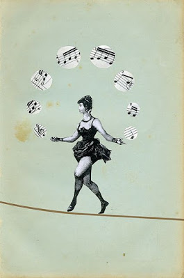

Figure 1.4 to Figure 1.5 - Pinterest Inspiration
I will not necessarily follow these compositions but I like the vibes it gives out - creepy but fun. It does look too complicated and messy for an After Effects composition, so for mine, I will simplify it and make it neater.

Figure 1.6 - Surrealistic Parallax Ideation 2
I like the black and white chequered board background but it was too plain so I warped it. Still looks a little too messy though and it takes the attention away from the main composition of my faces. I do like the round faced clown. I was thinking of letting it rotate and moving it diagonally upwards towards the most right corner.
With all these thoughts, I was thinking of animating the background on Procreate of black ink doodling. So it is like an animated wallpaper of a series of acts circus people would perform, maybe with a little highlights using only primary colours. It will make more sense once I draw it out.


Digital Photography & Imaging
- Week Twelve -
LECTURE/PRACTICAL
As per usual, Mr Martin continued to check on our exercises. This week, we looked through our latest and final practical exercise - Animal Displacement. I had to redo mine as it was just so bad, but I did struggle in the beginning. Initially I did a Zebra skin displacement on a dolphin, now I redid another one using a Hippopotamus and Snake skin. After displacing, the snake skin resembles a Pangolin's skin. I decided to name it a Hippogolin.

Figure 1 - My Hippogolin
This redo turned out better than expected. As it got closer to the head, I scaled the snake skin down and left some parts of the hippo smooth to make it natural. I toned down the hardness of the eraser to erase the awkward parts protruding out and where it would connect with the smaller scales. After displacing, I tweaked the Hue/Saturation and Colour Balance as I felt that it was too red and warm. I bumped up the blues/greens, reduce the redness and added a hint of contrast.

TUTORIAL
During tutorial, we were given consultation again with Mr Fauzi regarding our Final Project. Honestly, I felt like I was the slowest one there with the least progress so far. Looking at all my course mates' work got me worried because mine was no where near their level of creativity. However, I still showed my work for consultation because I really needed help. I was one of the last few ones to go.

Figure 1 - Final Project Composition
Mr Fauzi agreed with me where we both felt as if the background is taking the focus away from the main composition. I re-explained my idea as commented on Google Classroom back to him, and he told me to proceed with what I have first; to try it out.
I did try out the the doodling concept, it turned out so messy and just unworthy of a final project:

Figure 1.2 - Final Project Composition Doodling Concept
As usual, I had a creative block. I decided to take a break and come back to it later, but I do like how the main composition turned out. It just needs a little bit of touch ups here and there. My ideas started to flow better once I took a break. However, I did not have After Effects on my laptop as my laptop would not be able to take the software so I had to borrow my friend's laptop this coming Wednesday.
On Wednesday, I got started. With Mr Fauzi's recorded lecture and my friend's guidance, I was able to understand what was going on in AE. I took down notes as well:

Figure 1.3 - AE Notes


Figure 1.4 - Figure 1.6 - AE progress using friend's laptop
In no time, my final project was coming along quite well. I had some headaches along the way as my composition depended a lot of the timing process which was a huge PAIN. My eyes and brain were hurting but after taking a few short breaks, I was able to kick start again (also because my friend needed his laptop back soon). On some parts which were really difficult, my friend stepped in and explained it to me as I took down notes so I would not forget.
One of it which was the code for infinite loop: Loopout("cycle") and the number of keyframes I want it to loop. So for example, Loopout("cycle")5 into the desired property so it could be in Transition or Position.


Digital Photography & Imaging
- Week Thirteen -
LECTURE/PRACTICAL
This week, we did something different with Mr Martin! We were done with all of our exercises in Project 1, so we are gonna move on to something fun. We tried making a short animation/gif making using Photoshop. Mr Martin introduced us to a Japanese artist who shocked the Internet by animating her pictures as if she was levitating - Natsumi Hayashi.


Figure 1 to Figure 1.2 - Premiere Pro Progress (Parallax Animation)
It was a fairly easy progress, it was just that I could not export it like my other course mates. One of them managed to do it by exporting it to Media Encoder. Despite not being able to export it, I could still play what I have animated on Photoshop. I was really cool! Now, I can animate my pictures. This practical session reminded me of AE. Especially with the keyframes and properties.


Figure 1.3 to Figure 1.4 - Premiere Pro Progress
This was a little bit more confusing but still manageable. Gif making takes time if we want to edit our gifs to be seamless but it was a good session to get a glimpse on how gifs are produced. Really thankful for Mr Martin for walking us through this session!


TUTORIAL
The only part that I could not grasp was the fish movement. I made them move after Mr Fauzi suggested them to from side to side but really slowly in consultation on Week 13. With some guidance from my friend, I managed to do it. Here is the final outcome which I have uploaded onto YouTube: Surrealistic Parallax - Final Project DPI
Once AE was done, I moved onto Premiere Pro where I added the music. As my concept is somewhat quirky, peculiar and borderline creepy, I chose a creepy circus music as my background.

Figure 2 - Premiere Pro Progress
Overall, this project was interesting. I did hit some challenges along the way which has helped me to learn and design better, and I managed to grasp the basics of AE even though it is on a friend's laptop. This will definitely benefit me in the future as I do not need to depend on others for my design work. Mr Fauzi and Mr Martin has taught me so much throughout this course. Mr Martin focused more on the technical/practical side of Photoshop which came in handy with Mr Fauzi's tutorials as he taught us more on the other complimentary areas of Photoshop. Thank you guys! :)

Digital Photography & Imaging
- Week Fourteen -
LECTURE/PRACTICAL
TUTORIAL

Comments
Post a Comment