2.4.2021 - 16.4.2021 (Week 1 - Week 4)
Jodi Yip Mei Kei / 0340542 / BMC
Typography / Taylor's University
Task 1 / Exercises
LECTURES
Week 1:
This week, we were introduced to our lecturers, as well as, briefing of our
assignments and how this module was going to be like! Our slide lectures has
been pre-recorded (thankfully!) which we can view at any point in time, but Mr
Vinod suggested that we should watch simultaneously according to the weeks.
Furthermore, Mr Vinod showed us around our Facebook group as to where to find
our files, videos, etc. Everything is on the Facebook group, making it easier
for everyone to find our materials.
The first week consisted of about 2-3 videos:
Introduction, E-Blog & Week 1 (Development). In the introduction,
we were taught definitions/terminologies, why Typography is so important (in
different industries too!), the differences between fonts vs. typefaces and Mr
Vinod's experience in his field.
During our first class, Mr Vinod and Mr Shamsul made us watch the E-Blog video
together in our own space as they have a particular way of designing the blog
(I finally know how to embed pdf files). Once that was done, we were
instructed to update our blog every week. We were then told to watch the
videos for the first week which was these as well as the
Development of Typography.
As for the first proper lecture of the week, I learned a lot as to why it is
necessary for us to have typography in our lives despite our related fields.
Typography is not just for typographers per say, but it is for literally
anyone who
arranges words, letters, numbers for publication, display &
distribution - from clerical workers and newsletter writers to anyone
self-publishing materials.
It is not a form of design but a way of thinking. Surprisingly, it was fun
learning about the history -
Phoenician to Greek to Roman, Hand scripts, Square Capitals, Rustic
Capitals, Uncials, Blackletters
and more.
Week 2:
I have also started watching Week 2's lecture which talked
about the technical terms -
Describing Letterforms, Basic Fonts, Describing Typefaces,
& Comparing Typefaces. Terms such as 'stress' which talked about the
strokes in the round forms (some lines are thicker on one side
then gradually goes back thinner), 'boldface' vs
'light' and many others. It was so technical, it will
take me a while to memorise/understand them all. Generally, it
is easy to understand, but there were so many specific terms
for each part of a typeface/font.
Week 3:
This week's lecture was separated into six parts:
Text Tracking / Text Formatting / Texture / Leading & Line
Length / Type Specimen Book / Indicating Paragraphs(Week 4)
Text Tracking involves Kerning & Letter Spacing whereby
it is the automatic adjustment of space between letters and to add
space between letters respectively. They often get mixed up so it
is important to understand the difference between them as they are
vastly different. Tracking is the adding and removing of
space within a word, sentence or even letters.
Fig. 3
Slides
Designers tend to letter space between uppercase letters compared
to lowercase letters because uppercase letters are able to stand
on their own. However with lowercase letters, for readability
sake, it requires a counter form.
Text Formatting was fairly easy to understand:
Flush Left / Flush Right / Centered / Justified
Flush Left emphasises where we would usually begin
writing which is on the left, creating an asymmetrical experience
of writing. Centered poses a symmetry on the text. There is
equal value on both sides, creating balance upon the eyes.
Flush Right is the opposite of Flush Left. It can be useful
when writing captions. Justified is a personal favourite.
It poses symmetry on both ends,
"The resulting openness of lines can occasionally produce
'rivers' of white space running vertically through the
text."
Texture correlates with how typefaces make the readers
feel. Different typefaces evokes different feelings and suit
different messages. For example, if it was a funeral, you would
not want to have Comic Sans or something animated looking on the
invitation right? Apart from typefaces, the colour, style and
weight of the typeface are important in evoking the desired
feeling as well.
The goal in Leading & Line Length is to allow readers
for prolonged reading. Therefore,
Type Size, Leading & Line Length all plays an important
role. Leading refers to the distance between each line of
text. If it is too tight, readers might lose their placement. If
it is too loose, it can distract the reader.
Line Length basically refers to the amount of words.
Ideally, around 35-65 characters would be great per line. Shorter
lines requires less leading while longer lines requires more.
Extremely long or short line lengths do negatively affect the
readers experience.
Type Specimen Book talks about composition.
"Text should create a filed that can occupy a page or a screen.
Think of your ideal text as having a middle grey value and, not
a series of stripes"
:

Week4:
This next lecture is a continuation of the
previous one where Mr Vinod will take us through
a larger amount of text as previously he
highlighted on the colours of text,
sizing/alignment and etc. The slides were
separated in different parts: Indicating Paragraphs / Widows & Orphans
/ Highlighting Text / Headline within Text /
Cross Alignment
This recorded lecture was pretty much covered
during our online class but we still had to
watch it nonetheless. When it comes to
indicating paragraphs, most of us would normally
click enter twice but that method is wrong. In
InDesign, there is the 'pilcrow' function that
allows us to not only separate large chunks of
text into paragraphs, but also to control the
spacing of the paragraphs. By using this
function, it shows how knowledgable we are in
typography as well.
Fig. 4
Slides / 24th April 2021
There is also a difference in Line Spacing & Leading. At first, this
was a bit confusing to understand but I managed
to get it. Leading refers to
the space between two sentence (above &
below) whereas Line Spacing takes into consideration of the baseline of the
sentence below and the descendant of the
sentence above.
Another way of indicating paragraphs is
using Indentation. Note: When
using indentation, never have ragging on the
right side (flushed left). Best used on
justified text.
In typesetting, there are two unpardonable
gaffes - Widows & Orphans.
Widows refer to a short line of type
left alone at the end of a column of text.
Orphan is a short line of type left
alone at the start of a new column.

Fig. 4.2
Slides / 24th April 2021
A solution to break the widow is add a Force Line Break which allows another word or two to
join the widow. Orphans require more care as
typographers must be attentive to not allow a
lonesome line by itself on the start of the
next column.
Next, there is Highlighting Text. Highlighting text does not always been taking
a highlighter and create neon streaks all
over. Especially not on digital print (that's
just ugly and messy). So there are many ways
to highlight a text:
-
Changing typefaces but still within the
same type family
-
Point sizes, changing colours (black,
magenta, cyan as yellow is too
bright)
-
Adding a field of colour at the back of
the text
- Italics
-
Placing certain typographic elements
outside the left margin of the column of
type
-
Primes (') & Quotation Marks
(") *primes are very different from quotation
marks. Quotation
marks quote things
whereas primes showcases/emphasises a word
- Bullet points/markers
However, understand that when changing point
sizes, not all will be uniform in size. For
example:
Fig. 4.3
Slides / 24th April 2021
Then there is Headline Within Text as most of us are familiar with - subheadings
etc.
Fig. 4.3 to Fig. 4.6
Slides / 24th April 2021
There is a vast difference between each of
these headings. When put together, they
form Visual Hierarchy or Information Hierarchy. It
shows the reader what comes first and what
comes next in accordance to that.
Lastly, Cross Alignment. When
texts are cross aligned to each other within
their columns, it provides a visually pleasing
experience even if the reader does not notice
it.
Fig. 4.7
Slides / 24th April 2021
Week 5:
In this week, I started on the Text Formatting 1:4 to 4:4 lecture
recordings.
Text Formatting 1:4 // Kerning &
Tracking
Here, we looked more in-depth on why and how
to kern & track using the 10 typefaces Mr
Vinod has provided us.
Fig. 5
InDesign Practical / 27th April 2021
According to Mr Vinod, what we should be
focusing on when we kern is awkward spaces and
counter spaces between the letters. Firstly,
select the two letters that has such qualities
and adjust accordingly (Opt + Left Arrow Key).
Fig. 5.2
Before Kerning / 27th April 2021
Fig. 5.3
After Kerning / 27th April 2021
If we find the kerning a little too close and
we wish to reduce the kerning value,
for Mac users, head
to InDesign > Preferences > Units &
Increments > Change the value of
Kerning/Tracking from 20em to 5em.
Once kerning is done, if we wish to add some
general tracking (Select all > Opt + Right Arrow
Key) for an evenly spaced out typography style, we
can.
Fig. 5.4
Kerning & Tracking for our names /
27th April 2021
We are allowed to experiment with the
typefaces (bold, condensed, italics) and see
which one suits best. This video is a
practical example of what Mr Vinod showed us
in last week's class so this was a good
refresher for us to get the hang of InDesign
before our project 1.
Fig. 5.5
Kerning & Tracking for our
names final / 27th April 2021
Text Formatting 2:4 // Font Size, Line
Length, Leading & Paragraph Spacing
Firstly, we must learn how to manipulate
the Grid System. It
basically allows you to arrange information
in a given space. "A good page layout is heavily dependant
on an attractive margin space."
In order to do so, we must first change the
margin space: Make sure it is on page 2 > Layout >
Margins & Columns.
*Note: When you have a uniformed
and standard margin space on all size, it does
not make your document appealing. By having
different margin spacings, it creates Dynamic.
Ideally, the number of characters per line
should correspond to the font size. As
mentioned earlier, in an A4 document, font
size should be about 8 to 12 points. Each line should contain an average
of 55 to 60 characters. Using
the text provided on the Facebook group, I
proceeded to follow the video.
Fig. 5.6
Font Size and Number of Characters
/ 27th April 2021
Despite Mr Vinod's video on making
the Leading at 11 points, I
made mine 12 points as the content/paragraphs
are different compared to the one in the
video.
Next, we need to determine the Paragraph Spacing which is done by the Space After Function. Following Mr Vinod's video, I did 11 pt.
Recap: When choosing a font size
(8 pt - 12 pt for A4), look at the number of
characters per line (55 - 65). Then you can
introduce the leading which is usually 2
points larger than your font size. This unit
will then be used in your paragraph spacing.
Now, half close your eyes to see if the
negative & positive spaces are evenly
spaced out. If the whites, blacks and greys
are balanced, that is a good
composition.
Fig. 5.7
End Product of Text Formatting 2:4
/ 27th April 2021
Text Formatting 3:4 // How to Connect Text
Fields, Alignment & Ragging
In any design, we must identify the hierarchy of information - what we want our viewers to see first
before moving onto the other aspects. Identify
them and arrange them accordingly.
Mr Vinod started off this video
by Placing an image with
the Place function (Cmd + D). Personally, I used the Rectangle Frame Tool to first visualise where I want my image to
be and its size. I then resized the image
according to the column size.
In InDesign, you cannot directly manipulate
the picture as you would in Illustrator or
Photoshop. When resizing, you will only resize
the outer border and not the picture itself.
To adjust the picture size itself, you need to
click the Selection Tool (A).
Fig. 5.8
Frame Fitting Options / 27th April
2021
These
Frame Fitting Options allows you to fit the image according to the
border that was created.
When dealing with a topic or same content
paragraphs, you cannot switch or change the
body text sizes around. This can create a
misconception to the readers, thinking that
they are two separate pieces of text. So
always remember to keep the same type width
for the same type of information you are
dealing with.
Fig. 5.9
Right Side Ragging / 27th April 2021
Now have to fix/smoothen the ragging on the
right which has to do with Letter Spacing & Kerning. Highlight the
line that is far off the line above and below
and kern. Rule of thumb is to not exit 3 units
of kerning.
Usually, there can be Hyphens (-), this can be gone with the
function Hyphernate. Once the
kerning of the lines are adjusted, we looked
into Adjustment. In this
particular text, it is good to
use Flushed Left, Left Justified, or Central Justified. I
chose Left Justified as I think it looks
better.
Next, we were taught to align the text to the
baseline of the columns. Click Cmd + B to get the Text Frame Options.
Fig. 5.10
Left Justified & Bottom Align /
27th April 2021
Text Formatting 4:4 // Layout
Mr Vinod started off the last video with his
layout of the text. The Visual Hierarchy, Balance of
Layout & the use of Space will
create a nice layout.
In this particular video, Mr Vinod highlighted
on Baseline Grids & Cross Alignment. Before proceeding to that, we must first
adjust where we want our information to be. We
first adjusted our headline point size to 17.
Next, in order for cross alignment to happen,
we must make sure our leading is on multiples
of 2.
Essentially, a Baseline Grid (View > Grids & Guides
> Show Baseline Grid) is to ensure each line of the text sits on
the baseline grid and by doing so, the column
of text on the left and
right will achieve cross
alignment.
Fig. 5.11
What are Baseline Grids / 27th April
2021
These lines can only be seen when zoomed in
but we can also adjust the view threshold by
going to InDesign > Preferences > Grids >
Change the Increment to 11 > View
Threshold to 50%. Next, Select both body text > Right click >
Text Frame Options or Cmd + B. Make sure it is
now aligned to the top with
the baseline options to leading.
Now when zoomed in, every line of text is
sitting above the baseline creating a cross
alignment.
Fig. 5.12
Final Outlook from Video / 27th April
2021
INSTRUCTIONS
<iframe
src="https://drive.google.com/file/d/12K2FIHvpAIxRyMtspTe93F_23qj2tcju/preview"
width="640" height="480"></iframe>
EXERCISES
Task 1 Part 1 // Type Expression
Week 1:
We were then tasked our first exercise: Sketches for the chosen words (4).
Here is mine:
Fig. 1
Sketches for Wave & Scream / 2nd April 2021
Fig. 1.2
Sketches for Spin & Slice / 2nd April 2021
There are some designs I got inspired from my research on Pinterest but
could not replicate them as they were done via
Illustrator/Photoshop.
Week 2:
Starting off straight into our sketches! Mr Vinod took our attendance
via us posting our sketches into the facebook group in the comments.
Both he and Mr Shamsul praised some our work as they scrolled along as
well as reminded us to not use animation/pictorial images in our
exercises. It took us about 20 minutes to get everyone to upload,
hopefully it will be shorter next week.
We were then separated into random breakout rooms for our friends to
give constructive criticism of our sketches and vice versa with the four
questions provided by Mr Vinod:
1. Are the explorations sufficient?
2. Does the expression match the meaning of the word?
3. On a scale of 1–5, how strong is the idea?
4. How can the work be improved?
Through this, I met some amazing individuals and aspiring
creatives, and ended up (hopefully) as friends throughout this
module. The feedbacks can be seen in the feedback section. Mr Vinod
and Mr Shamsul will give their general feedback via the comments in
our posts soon, and we are to record them via our blog and Google
Spreadsheet.
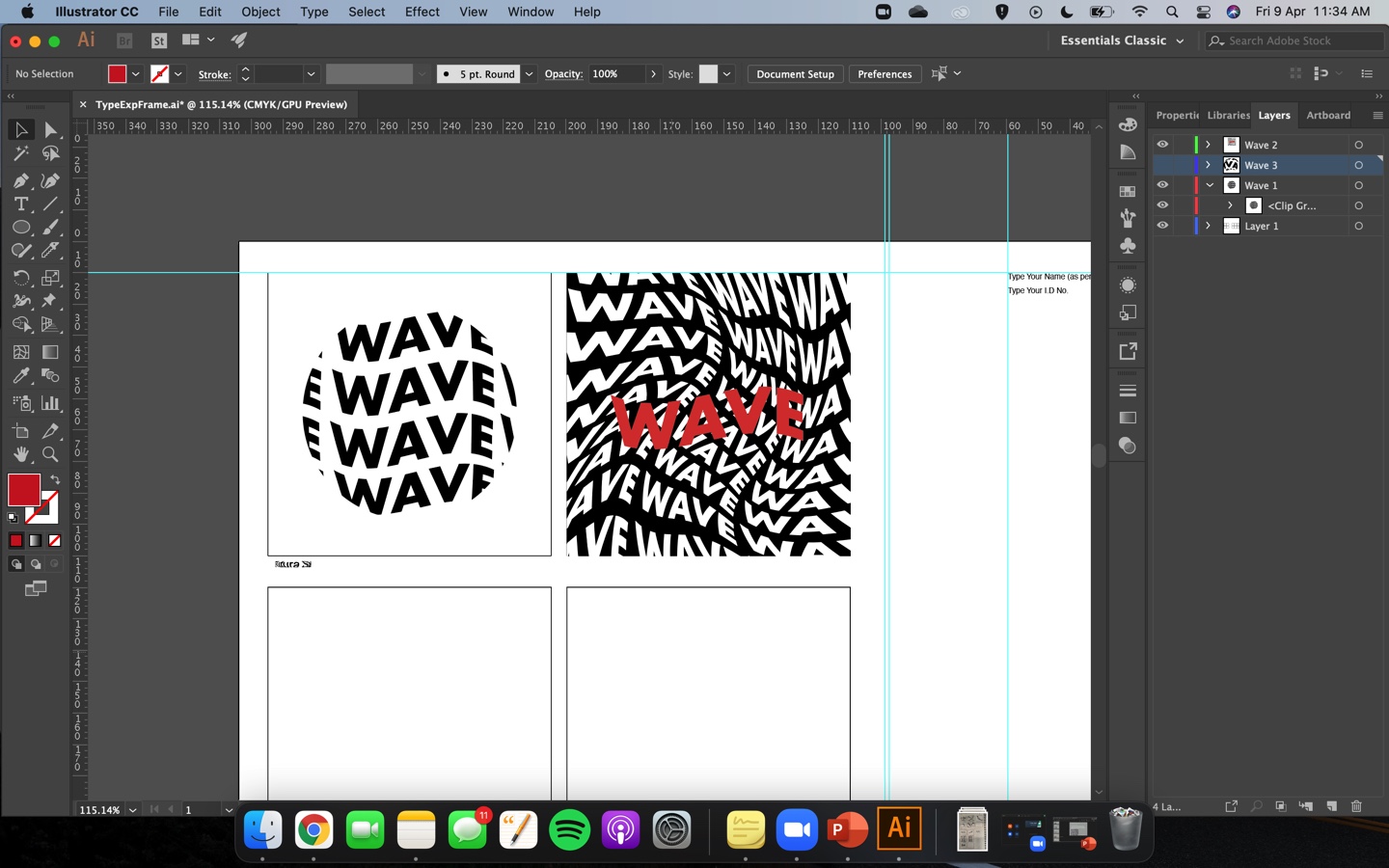
Mr Vinod and Mr Shamsul then gave a small lesson on digitising our
sketches in the template provided:
Fig. 2
Mr Vinod's Practical Lesson / 9th April 2021
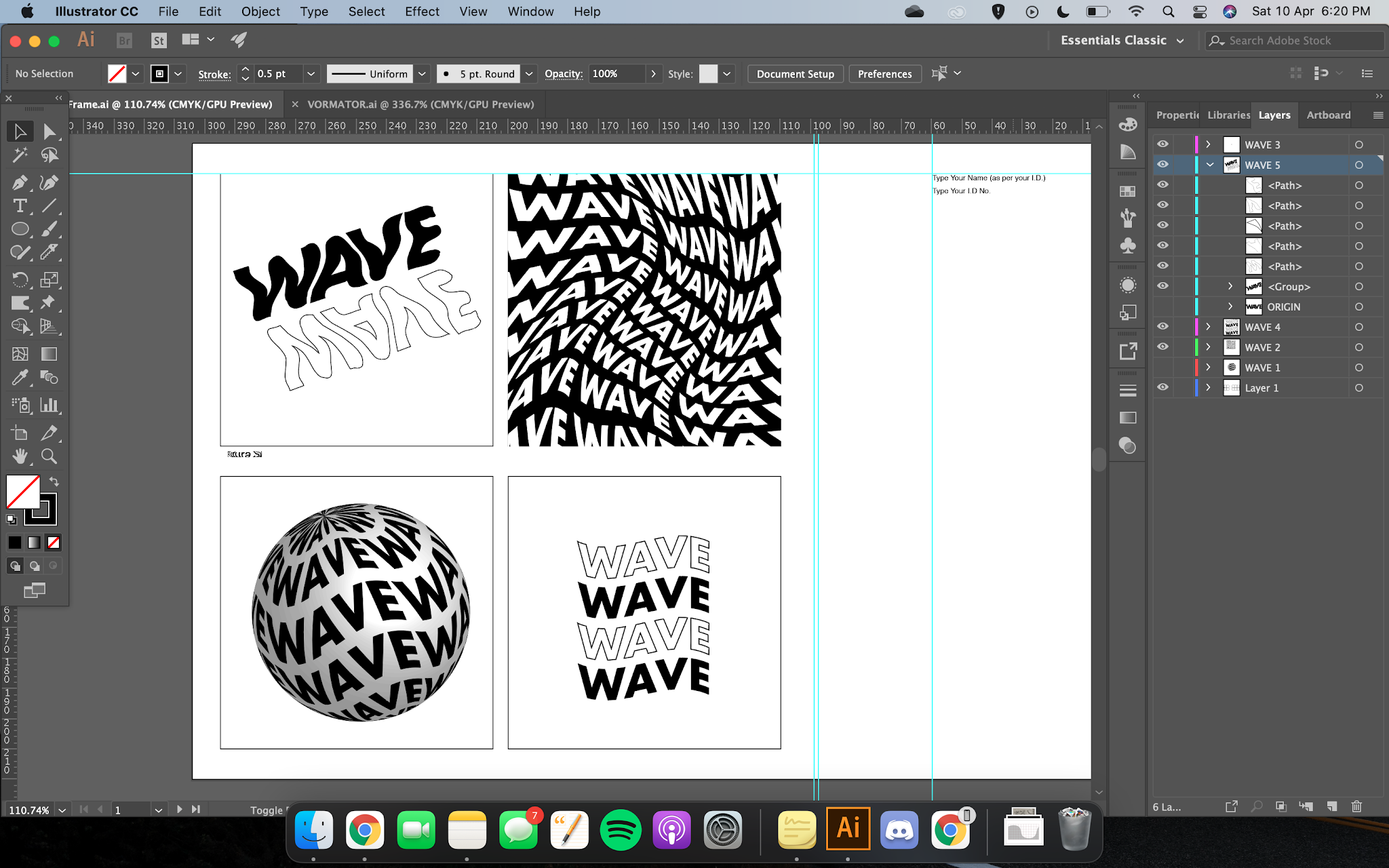
Fig 2.2
Mr Shamsul's Practical Lesson / 9th April 2021
Fig. 2.3
Mr Shamsul's Practical Lesson (Masking Part 1) / 9th April 2021

Fig. 2.4
Mr Shamsul's Practical Lesson (Masking Part 2) / 9th April 2021
After this, we were given about 45 minutes to an hour to attempt
digitising our designs and to post them in the Facebook group.
Reason being is that Mr Vinod wants us to address our concerns now
while they are contactable rather than later. Here is mine:

Fig 2.5
Digitising Attempt 1 / 9th April 2021
Mr Vinod said it was not bad but no colours. I had a lot of
fun playing around with the effects! I really wanted to create
a 3D globe with the typography on them so I added that thought
after class.

Fig. 2.6
Outcome So Far / 9th April 2021
These are just mainly for fun; trying to understand and
familiarise myself again within Illustrator. I
used Futura Bold here and I generally
just liked the outlook of the typography. The only sketch
digitisation I did was the 'Groovy Wave' aka the
top left which turned out pretty great but it could be
better.
Week 3:
Fig. 3
Digitalisation of Exercises / 16th April 2021
>
Beginning with submitting our digitisation of our
exercises via Facebook for our attendance, we then head
over to our designated breakout rooms for peer feedbacks.
Here are this week's questions:
1. Do the expressions match the meaning of the
words?
2. Are the expression well-crafted
(crafting/lines/shapes)?
2a. Do they sit well on the art-board?
2b. Are the composition engaging? Impactful?
3. Are there unnecessary non-objective
elements?
4. How can the work be improved?
These were a different group of individuals which was
great as I got to meet new people and receive a
broader range of feedbacks. The feedbacks can be seen
in the Feedback section. Overall, it was good. Mr
Vinod and Mr Shamsul then gave a practical session on
how to animate our typography exercises via
Photoshop:
Fig. 3.2
Animation / 16th April 2021
I found this to be very insightful! I learned a bit of
Photoshop animation back in my Digital Photography
& Imaging module but it was just a quick run
through so this was a good refresher. It will take
some time for me to get used to animating my exercises
but I am sure it will be alright.
So I started on my animation on 'Slice'. Took about 4
tries on illustration as I wanted to achieve a smooth
gif.
Fig. 3.3
Illustrator progress / 16th April 2021
Fig. 3.4
Photoshop progress / 16th April 2021
I had to be very attentive when creating the
layers as I do not want to miss or overlap any of
them. However, my photoshop was acting up by the
time I wanted to export. Hence, I had to ask my
friend for help.
Fig. 3.5
4th Attempt / 16th April 2021
After uploading our work onto the Facebook post as our
attendance, Mr Shamsul & Mr Vinod went through
each of our e-portfolios and gave me several
suggestions to improve my gif. This can be seen in the
feedback section.
During our breaks in class, I worked on improving my
gif. I took a step back and try not to complicate my
thought/ideation process as I felt that was what made
the 4th attempt looked the way it does. So from 87
frames, this 5th attempt only had 10 frames.
Week 4:
Continuing from the previous week, we uploaded our
work onto Facebook as per usual, Mr Shamsul & Mr
Vinod went through each of our e-portfolios and gave
me several suggestions to improve my gif. This can
be seen in the feedback section.
During our breaks in class, I worked on improving my
gif. I took a step back and try not to complicate my
thought/ideation process as I felt that was what
made the 4th attempt looked the way it does. So from
87 frames, this 5th attempt only had 10 frames.

Fig. 4
5th Attempt / 23rd April 2021
This was much better in my opinion but I have
decided to animate another word: Scream.
Fig. 4.2
Scream Illustrator Frames / 23rd April 2021
Before settling the Photoshop problem, I quickly
attempted these gifs first and asked if my
friend could export them for web again. I
decided on placing the word far back at the end
to produce that impact when it comes forth. At
first I wanted it to be chaotic with just a
normal, undistorted font but as I experimented,
it somehow shaped into a mouth which I then
thought it makes sense.
Just like a scream, the mouth in the end does
not really matter but it is the chaotic,
shrillness of one's voice that dominates.
TASK 1A EXERCISE 1 SUBMISSION:
Fig. 4.3
Final Submission / 23rd April 2021
Task 1 Part 2 // Text Formatting
In today's class, Mr Vinod briefed us on our next project which is called Text Formatting. Based on
our lecture slides and recordings, Mr Vinod
instructed us to watch Typo 3 Pt. 1, Typo 4 Pt.2 & the whole series of Typo Text Formatting 1:4 - 4:4 to gain a better understanding and equip
ourselves with the right skills to start on this
project.
This project consists of two parts:
1) Watch the videos and show proof that we have
watched & understood them by
attempting/following
2) Create our own single-page layout using the
skills/knowledge acquired from our independent
learning
Once we were briefed, Mr Vinod then walked us through the overview and basics of InDesign.
InDesign is software used mainly for magazine/book layouts. Hence, the features such as Kerning,
Leading, Baseline Shift, etc help make the reading
experience for the reader an enjoyable one. Compared
to InDesign, Illustrator focuses more on the
graphical aspects of design. Mr Vinod also included
short cut keys such as:
Kerning: Opt + Left Arrow Key
Hidden Figures: Cmd + Opt + i
Fig. 4.4 to Fig. 4.5
InDesign Walkthrough / 23rd April 2021
Week 5:
After watching all the videos pertaining to Text
Formatting, I am ready to start on the first part of the project. Firstly, I decided to head over to Pinterest for some inspiration. My aim
was to look at simple, clean, and minimalistic designs that get the idea/content across without too many obstructions. These are my layout
designs:
Fig. 5 to Fig. 5.3
Text Formatting Ideation
Process / 30th April 2021
TASK 1B SUBMISSION:
Fig. 1
Text Formatting Submission / 30th April 2021
Fig. 2
Text Formatting Submission PDF / 30th April 2021
At the end, Mr Vinod briefed us on our
actual task which was to create a two-page
spread on the editorial text provided in the
Facebook group.
FEEDBACK
Week 1: N/A
Week 2:
Specific/Peer Feedback: We were separated into breakout groups for our
specific/peer feedbacks. I was grouped with Lavender Ting, Yuan Wei, Kai Jun
& Sukhvindar. They explained that my idea exploration was enough however,
some of the expressions do not match the words which I agreed. Especially the
'Teeth Scream', it was too cute. Another improvement would be the making the
mouth wider/longer to imitate the expression of screaming.
Overall, they agreed my work was good and gave me a 3.5/4 rating and said that
once it is digitalised, it would come out clearer.
For each word, they chose some of the best ones out of all of them:
Slice - Slice of Slice, Knife Slice, Distorted Slice
Spin - Distort/DNA, Minimalist/Record Disc
Wave - Groovy Wave, Logo Wave, Liquid Splash Wave
Scream - Gradual Scream, Chaotic Scream
Week 3:
Specific/Peer Feedback: We were separated into breakout groups for our specific/peer feedbacks. I
was grouped with Caelan, Toh Jun Tai, Tian Xiang & Effyna Adiana. Most
of my feedbacks came from Caelan and Jun Tai. They both expressed positive
reactions to my work as well as giving me pointers/feedbacks.
Overall, it was good feedback.
Wave: All matched the expressions, especially the first one. It is only the
3D globe Wave that had an unnecessary element, which was the globe
itself. I agreed as well.
Scream: Peers loved the Chaotic Scream. However, peers were worried about
having too much distortion.
Slice: Slice of Slice was the best. Peers felt like it could be a logo for
a company. The Distortion Slice (it is not distorted though, just cut and
stacked), it did not really match the expression well as peers said it
reminded them of reflected glass instead.
Spin: We all agreed that it was difficult to achieve the distortion I wanted
to achieve which is like an illusion.
Week 4: While Mr Shamsul & Mr Vinod went through our e-portfolios,
they gave several suggestion to my animated gif. Firstly, it was too slow and
were shocked to find out I had 87 frames. So in order to speed the gif up, I
have reduce my frames (4-5 frames). I also need to imagine the slicing motion,
it is fast and sudden so that can be achieved by lesser frames. Also, I need
to loop it.
Mr Shamsul liked how the 'E' got sliced thus I will keep that part.
Week 5:
Specific/Peer Feedback: I was grouped with Slyvester, Ellis and Mariam. Overall feedback was good.
Just had to take note of the rivers in my justified text.
General Feedback: Mr Vinod told me the same thing about my justified text and told me to
increase the gutter size to 7pt as well
REFLECTIONS
Task 1 Part 1: Type Expression & Task 1 Part 2: Text Formatting (I Am
Helvetica)
Experience: Overall it was good. Challenging no doubt but I
enjoyed it nonetheless. The only part that frustrated me the most was the
animation part where we had to create a gif out of our chosen word.
Personally, I feel like my sketches and digitisation of the typefaces were
much much better than the gif itself.
Observation: I found that I need more practice in Illustration.
Building shapes is alright with me however, typography is a whole different
ballgame as there is so much more technicality to it as opposed to just
creativity.
Findings: I found that I complicate my designs unnecessarily and it
made them harder to progress and ideate. Simplicity is key but as Mr Vinod
said, it is not easy to achieve. It is human nature to want to impress and be
fancy but it can get complicated with the end product looking bad. Hence, I
will try to start simple.
FURTHER READING
Week 1:
Fig. 1
Extra Reading / 2nd April 2021
Week 2:

Fig. 2
Youtube Video Extra Research / 9th April 2021
Week 3:
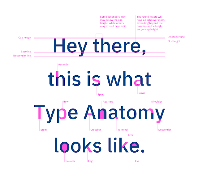
Typography Design 101: A Guide to Rules & Terms
Fig. 3
Extra Research / 17th April 2021
Fig. 3.2
Extra Reading / 17th April 2021
The Vignelli Canon is a very aesthetically pleasing yet interesting book.
It taught me on the aspect of Grid, Margins, Paper size, Basic Type Faces,
Layouts and much more.


Comments
Post a Comment