6.5.2021 - 30.6.2021 (Week 6 - Week 9)
Jodi Yip Mei Kei / 0340542 / BMC
Illustration & Visual Narrative / Taylor's University
Project 2 / Decisive Moment
LECTURES
Week 6:
Frankly, the practical session for this class this week was so intense. Mainly because animating in Photoshop or After Effects is so cumbersome and intimidating for me.
Fig. 6
Photoshop Animation Demo // 6th May 2021
Mr. Kannan was really patient with us and answered all our questions. He even gave me suggestions on how to let AE run on my laptop and found an alternative software for me, but he did mention that Photoshop should be sufficient enough for me.
He drew out the flow of a bouncing ball and introduced the concept of 'onion layers' where the layers are all translucent. Thus, we can see all layers of how and where the ball is going to go.
Week 7:
Hari Raya Holidays
Week 8:
E-Learning Week
1) Squash & Stretch
2) Anticipation
3) Staging
4) Straight Ahead Action & Pose to Pose
5) Follow Through & Overlapping Action
6) Slow In & Slow Out
7) Arc
8) Secondary Action
9) Timing
10) Exaggeration
11) Solid Drawing
12) Appeal
<iframe
src="https://drive.google.com/file/d/1mZcXgVVwT6Aqf7fhF67zmnmvBoq0RilH/preview"
width="640" height="480"></iframe>
Project 2 // Decisive Moment
Week 7:
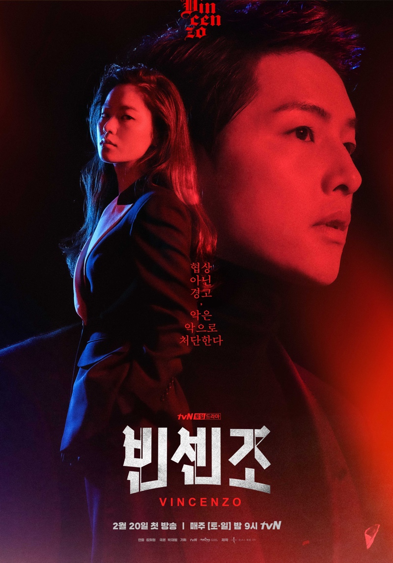
I decided on the Korean drama 'Vincenzo' as my inspiration for this project. *Spoiler* The moment where he found out his enemies killed his birthed mother was when his demeanour changed the most, deeming it the most pivotal moment of the show. I wanted this animated poster to have stark contrasts like Chiaroscuro. Very James Bond style - simple but sophisticated. With that, I chose the colour scheme of Navy, Black, Cream, Grey and Red with different values and hues.
Firstly, I studied the episode of which his mother died:
Fig. 7
Vincenzo scene study // 13th May 2021
I did not want this poster to be complicated as it would make it difficult for the animation process. The idea would be of him standing in front of the community building where he spent his moments in while living in Korea (there is a connection, it is not just some random building) at night, his glock and silencer pointed just below the viewer's eye view before he shoots. In a sense, we would be looking at him from below, where he looms before us.
This is where the animation comes in, when he shoots, the bullets hits 'us' and blood splatters across the screen and him, sliding down to the cavities of the name VINCENZO. The blood splatter that slid down would make his name more visible.
Initially I wanted to have him walking away in a long, lonely hospital hallway with a gun in his hand. Just a silhouette and the hospital hallway lights flickering as he either walks towards us or towards the other end.
This is what I did so far for that concept:
Fig. 7.2
First Attempt at Vincenzo // 13th May 2021
Added the ray of light for a moonlight effect. Not sure if I should draw his facial features, might turn out weird. I will probably add more details to the building like the Korean words of the shops, etc, and maybe even people standing behind him to show that he has a 'gang' because the people in the building behind are his friends and allies - some wearing hats, ponytails etc. Just their silhouettes.
Essentially, this is the base of the animation.
I sketched out another similar concept where he walks away from Lawyer Cha in the hospital after finding out about his mother towards us. In that sense, we are the murderers of his mother:
Fig. 7.3
Frame by Frame sketches into a gif // 13th May 2021
Experimented with different frames by sketching them out on Photoshop first then animating it via Photoshop as well just to see how this would look like. The ending would ultimately be the same,
bullet shoots out, hits us, blood splatter on camera effect, blood slides down into the cavities of 'Vincenzo' to revel his name.
Week 8:
Fig. 8
Attempt 2 with a different concept // 20th May 2021
Personally I like this concept more. There is more room to play with in terms of positioning, depth and scenes.
Week 9:
This week, Mr Kannan gave us the opportunity to our work inspected by him for areas of improvement. When it came to mine, he mentioned some ideas for the background like the shadows and lighting to create that ambience and depth. He said that my frames were enough, there was no need for my animation to be so smooth as if it was a 2D animation film as I mentioned that I wanted Vincenzo to be walking smoother.
Fig. 9
Mr Kannan's demonstration // 28th May 2021
Fig. 9.2
Mr Kannan's demonstration // 28th May 2021
I tried drawing the shadow-like features for the face, but it actually removed the seriousness and mafia-like ambience of the gif so I decided for it to not have any facial features. I googled how to make a smoke brush as I want to recreate the aftermath of a shot.
Fig. 9.3
YouTube tutorial of creating a smoke brush // 28th May 2021
This week is submission week so I need to speed up my progress up a little bit more. I looked back at the poster of Vincenzo for more inspiration. I really loved the red and blue tinge:
Fig. 9.4
Vincenzo poster // 28th May 2021
From there, I just did a sketch of what I want the background to be like:
Fig. 9.5
New digital sketch // 28th May 2021
Fig. 9.6
Frames in Photoshop (progress) // 28th May 2021
Fig. 9.7
Frames in Photoshop (progress) // 28th May 2021
This is where I took inspiration from the poster. I traced out the Korean syllables for 'Vincenzo' and did a clipping mask over it with a black and white stone texture using soft light:
Fig. 9.8
Stone texture // 28th May 2021
Felt like this added a nice touch to the name as the off-white seemed bland and flat on its own. I was struggling a lot with the background, mainly the grey parts. I tried masking it with a cement texture but it got really weird so I scratched that idea. Then I realised, I do not want this to be complicated. Instead, I added subtle shadowing to the back of the door and the luminance to the bullet using different brushes and gradient on Illustrator.
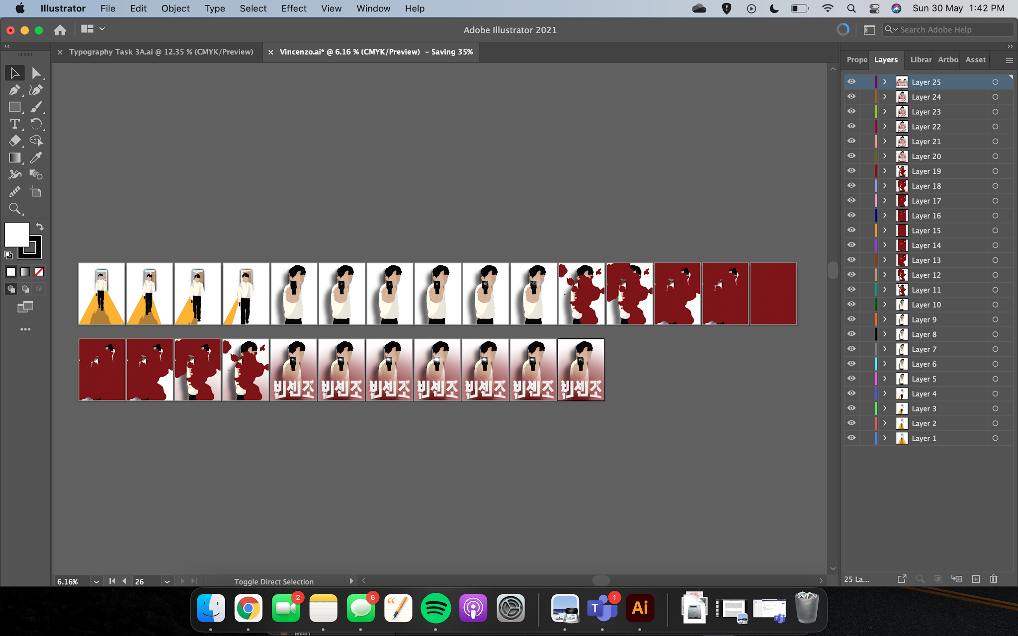
Here are some progress screenshots using Illustrator & Photoshop:
Fig. 9.9 to Fig. 9.12
Progress // 28th May 2021
This is the final outcome and submission:
Fig. 9.13
End product // 28th May 2021
I used a mixture of brushes & the pen tool - soft airbrush (medium to low opacity), pen tool to create the vectors, gradient to create the luminance. This animations aims to achieve the classy, sort of jazzy outcome. Hence the straight-forward and Chiaroscuro-like art. It has a high contrast to create the contrast and impact. As he walks away from the morgue where his mother lies which has light and pale colours of blue & grey, he comes into a darker place with the strong colours of mustard yellow and blood red.
FEEDBACK
Week 7:
Hari Raya Holidays
Week 8:
E-Learning Week
Week 9:
Mr Kannan commented on my work saying that it was alright and there was no need to produce more frames to make the walking smoother. As the work I presented was not yet completed, he could not comment much but overall, he was alright with it. He mentioned how this is not just about animating but telling the story behind the animation. From the get go, we should be able to convey the story we want to tell our audience and from mine, it was fairly clear.
REFLECTIONS
Task 3
Experience: At first I was wondering how am I going to achieve what I want to achieve without After Effects, but this project showed me that there is not need to complicate my artwork for it to become what I want it to. As this project spanned out for about three weeks, I did took a long time to complete it and the outcome turned out better than I expected for someone who has never done animation before.
Observation: This was quite therapeutic to draw and experiment. I found myself enjoying the process much more once I got a clear direction of where I want my animation to go.
Findings: Frame by frame animation is difficult! Luckily the onion framing window helped me see its motion properly. Initially I sketched out how I want Vincenzo to look like first and his positions and it was quite choppy. So that showed me I needed more frames and paid more attention to the detailing.
FURTHER READING

https://www.youtube.com/watch?v=FDbsV6OwBpU


Comments
Post a Comment