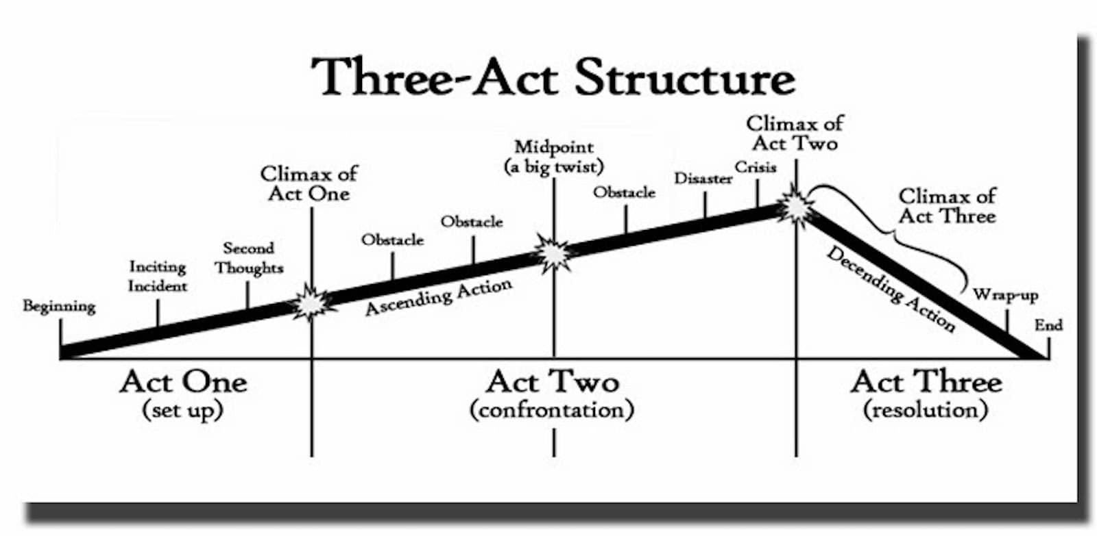
As the brief suggests, we are to create a 10-20-panel webtoon with the genre of 'Slice of Life' using the 3-Acts Structure:
Similarly to writing a short story, we need to have a clear direction and the plot we want our story/character to go through. The 3-Act Structure shows us a visual representation of how our story should flow.
Oftentimes, some of us might think a genre like 'Slice of Life' might not need such a structure, but it still does. Although it might not be as impactful and dramatic as an Action or Drama genre, this still provides us good direction.
After the lecture, I did some research myself. Slice of Life genre
usually has about 10-20 panels, 30 at most while Action/Drama genres
have about 60 panels per episode.
I started looking for inspiration with the artists that I already follow
on Instagram:
Fig. 9.2
Instagram Inspirations // 27th May 2021
They are a mixture of artists from Malaysia, Korea, & the US. They all have their very own distinct styles which I love about. Some are minimalistic while others are detailed which can be achieved on both digital and traditional means of illustrating.
The Korean illustrators, @yulri.kr & @puuung1, are known for their couple comics and books respectively where they are simple but warm & impactful. The people are drawn in simple strokes while they focused on the surroundings and lighting. @puuung1 has a
consistent warmth throughout her drawings while @yulri.kr has a stronger
contract in terms of light in her drawings that focuses on a single
colour (here she uses blue, other comics might be yellow or purple with
the contrast of off-white)
Both @natandrea & @antoniapang_, are graphic designers
mainly using traditional means of illustration judging from their
Instagram accounts - paint and markers. @antoniapang_ has a very
colourful theme and has done comic-like/zine styles. @natandrea has a
good mixture of typography and detailed illustrations using brush-style/strokes.
@janicesung & @vitkaninn focuses more on portrait illustrations using a combination of both digital and traditional illustration styles. I absolutely love the detailing on each drawing.
From the hair strokes to the dots of highlights around the face for framing. I love how @vitkaninn uses the colours to give a different feel to each of her portraits. It gives off a funky yet child-like vibe due to the color pencil-like colouring. The colours compliment each other very well. @janicesung leans more to the traditional side of colouring
but the detailing is immaculate! Her style is very soft and feminine compared to @vitkaninn.
Webtoon Inspirations:
Fig. 9.3
Webtoon Inspirations // 27th May 2021
From top left:
True Beauty by YaongYi,
Lore Olympus by Rachel Smythe,
Save Me by Big Hit Ent. x LOCI,
Star Children by Ro-taniah
These are just some of the Webtoons that I really enjoy - both story
& drawing styles. Their panels are also evenly spaced out so it was easier to read without my eyes getting hurt. In Lore Olympus & Star
The artists use colors to differentiate the characters that also symbolise their power, contrast, & characteristics.
In True Beauty & Save Me, they are more traditional like
manhwa drawings we would use to read growing up with cleaner
lines, predictable expressions. Even their drawing styles are different
in those two groups, Lore Olympus & Star Children have a more flowy
and even messier art styles that fit the ethereal tone of their webtoon
unlike True Beauty & Save Me.
Week 10:
I started sketching out some characters for my story:
Fig. 10
Sketches // 3rd June 2021
Ultimately, my story idea revolves around
Growth between two people who have met, enjoyed one another's company but drifted apart due to a series of conflicts. They then find each other again, unexpectedly.
This is more symbolic and depends heavily on the visuals which I wanted to show through the red string of fate.
Week 11:
Mr. Kannan confirmed with us that we are allowed to use other software besides Illustrator which is a big relief to the majority of us. Some of
us were wrecking our brains thinking how are we to create a
manhwa/webtoon style webtoon while using Illustrator. It is possible no doubt, but for the amount of time we have and other assignments, it will be extremely difficult.
He then advised me on my characters as he felt it was too realistic for
such a short amount of time, making me wonder if I should
change/simplify my characters. After listening to my other coursemates
pitch their ideas, I realised that my story was more dramatic and
melancholic, not to mention lengthy for a one-shot. Thus, I spent the
afternoon revamping my idea:
FEEDBACK
Week 10:
Shared with Ms. Anis my story idea about the concept of Growth between
two people. She said that my visuals for this would be strong enough but
I have to see how am I going to transition from one panel to another
considering that I have flashbacks.
Week 11:
After my first consultation, Mr. Kannan expressed his concern over how I
would finish my webtoon on time as my characters were too realistic
compared to a cartoon. Since it is too realistic, there is too much
detail I would need to focus on which is not ideal for such a short
amount of time. Thus, I completely revamped my idea.
Act I
Three close friends took a graduation trip to Seoul, Korea. The scene
begins with them about to land in Korea and arriving at the hotel. Once
arrived, they went on to unpack and explore the cityscape - the food,
people, and culture. Ultimately, they wish to create lasting memories
before going their own ways in adulthood. Also, they were shown the
realities of Korea than their usual expectations from K-Drama.
Act II
This is where the build-up of crisis happens where the girls
unexpectedly get robbed on their first night which spiraled their
relationship, leading to them having one of the biggest arguments
between them. Specifically Jamie and Nellie. Ella was trying to dissolve
the argument but nobody was listening to her. As they were robbed, they
cannot really do much other than to just walk it off but Nellie and
Jamie were still too busy arguing who's right and wrong.
Act III
Ella was about to burst as they still kept arguing, but while they were
aimlessly walking, they went up a hill and came across a beautiful view
of Seoul's cityscape in the evening. This reminded them that after all
they went through, all that matters, in the end, is their friendship.
The evening view symbolised the slowing of time and the beauty of being
in the moment, reminding them that all will be well.
After showing my new idea to Ms. Anis, she said this was nice and super
relatable. Just that I need to make my crisis more pivotal and gave me a
few suggestions - have the robbers rob the girls instead of them getting
scammed. I quickly sketched out how I see the webtoon comic would be
like:
I will change to name officially to J.E.N's Travel Diaries as J represents Jamie (the girl with purple hair), E for Ella (the girl with pink hair) and N for Nellie (the girl with blonde hair). Although their names won't really matter in this webtoon, it's good to have distinctions between them just incase.
Week 12 - Week 13:
I begin drawing the webtoon using Procreate as Mr. Kannan confirmed with
us that we can use any application apart from Illustrator as I felt more
comfortable with Procreate with the stylus and all. I wanted to make
this webtoon colourful, highlighting the feel-good and dynamics of
travelling. Ever since the lockdown, travelling has been stuck on my
mind and I wanted to bring that feeling to life. Here are some progress
pictures:
Fig 10.2 to Fig 10.8
Progress Screenshots // 17th June 2021
Week 14 - Week 15:
I struggled with adding more content while trying to adhere to the
maximum number of panels. So that took quite a while for me to finish
but I managed to.
After adding the speech bubbles and other small details, I started on
After Effect. Firstly, I rewatched Mr Kannan's practical lecture on the
basics of the application to freshen up my memory and wrote notes:
Fig 10.9
Progress Screenshots // 1st July 2021
I began the masking process while also planning how I want the webtoon
to look like as it flows. It was a little hard to grasp at some points
because you need to be very clear about how it flows and where exactly
do you want it to flow while another panel/speech bubble pops in.
Fig 10.10
AE Composition Settings // 1st July 2021
Following the practical video, I made sure I followed exactly as the
instructions with a resolution of at least 1080px. The only change I
made according to my webtoon was the duration where I made sure I had
some extra time spaces instead of the usual 30secs-1min. As for my
resolution, I left it at half s I could change it later on for lesser
cache files to render.


Comments
Post a Comment